Styling Elements
Anytime you click on a component in the Layout tab, its editable properties will open on the right side of the editor window in the component editor. Here, you can see that clicking on the component in the layout tab opened its relevant properties in the component editor:
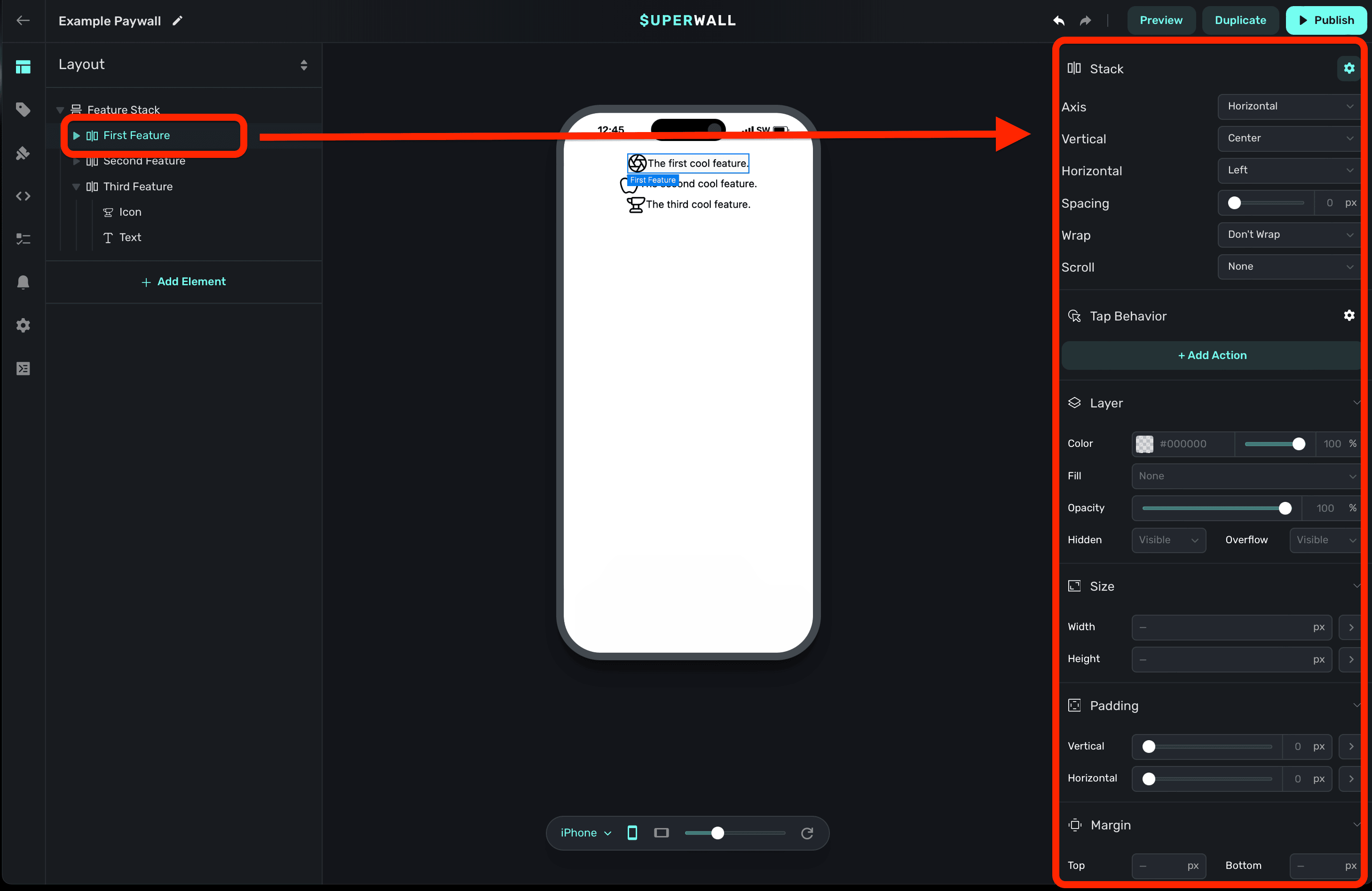
Component Specific Properties
By default, when you select a component you'll see properties that are specific to it at the top of the component editor. For example, when you select a stack, you'll see stack-specific options. The same is true of text and any other component. Notice how the options change at the top-right here when a stack versus a text component are selected:

Image generation
You can use A.I. to generate images. By selecting any image component, you can click on the AI Tools button to create an image based on the text and style you provide:
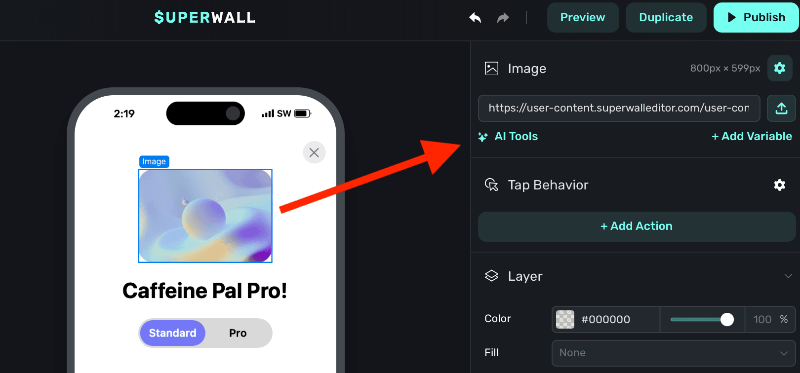
You are presented with two options:
- Generate Image: Use this to create a brand new image, or regenerate an existing one.
- Remove Background: This attempts to remove the background of the existing image element.
Generating images:
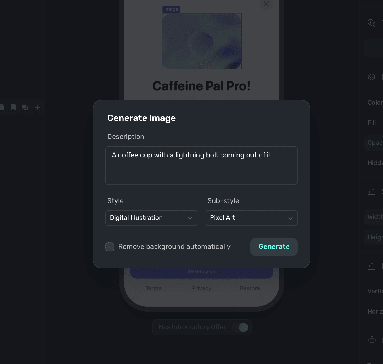
When the image generation editor modal is open, you can provide:
- Image description: A description of the image you'd like to generate. Generally speaking, the more detail you provide, the better the result will be. Instead of saying "Coffee up close", you might say "A close-up of a steaming cup of coffee with a heart-shaped foam design.""
- Style: The primary style of the image you're generating. Each one has several sub styles associated with it.
- Sub-style: A more specific style within the primary style you've chosen. For example, if you've chosen "Realistic Image", you might choose "Black and White" as a sub-style.
- Remove background automatically: Select this to have the image generator attempt to remove the background from the resulting image.
Here's an example prompt:
And, its result:

Common component properties
Most components share similar properties related to things such as sizing, padding and more. Those are covered in more detail below.
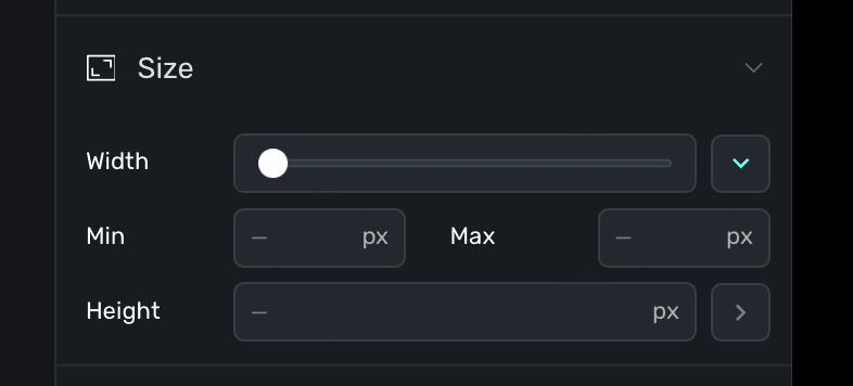
Note that for any property that deals with editing a particular size, you can click on the disclosure arrow to choose a specific unit (such as rems):
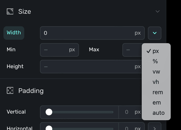
Further, most values accept either an input amount or you can use a slider to set one. Some elements support hovering over them to reveal a slider, as well:
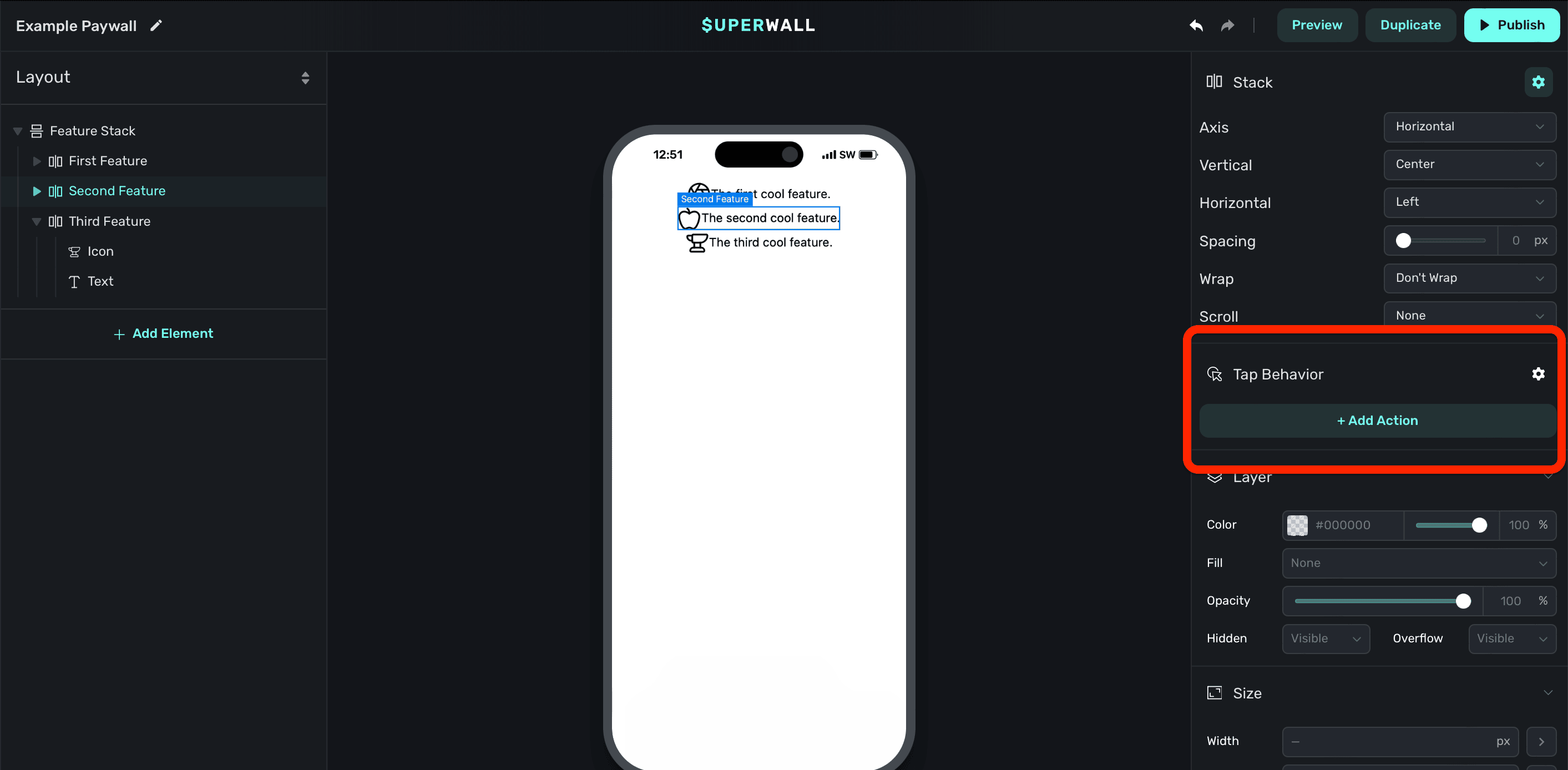
Tap Behaviors
You can have a component trigger a specific action when it's tapped or clicked by adding a tap behavior. To add a tap behavior, click a component from either the Layout tab or the preview canvas, and in the component editor under under Tap Behavior click + Add Action:
Available tap actions are:
Purchases
- Purchase: Begin a purchasing flow of the selected product. After a successful purchase, you can configure what happens next using the After Purchase setting. Options include Close (default), Navigate Page (advance to the next page in a flow), Open URL, Custom Action, Custom Placement, Set Attribute, Set State, or None.
- Select Product: Puts the chosen product in a selected state. Useful for scenarios such as focusing a product in a paywall drawer, for example, when something is tapped or clicked.
- Restore: Begins a purchase restore operation. Useful for restoring purchases someone may have made prior.
Navigation
- Navigate Page: Moves through a Flow. Use this to progress users through multi-page experiences like onboarding.
- Next: Advances to the next page in the flow.
- Back: Returns to the previous page in the flow.
- Close: Closes the paywall or flow.
- Open URL: Opens the given URL via one of three different ways:
- In-app browser: Attempts to open the link inside of the app using the platform's web browser control. For example, on iOS, this opens an instance of
SFSafariViewController. - External: Attempts to open the link outside of the app using the platform's web browser app. For example, on iOS, this opens Safari. Please note that the paywall stays presented when the link is opened.
- Deep Link: Similar to the external option, but it'll close the paywall before opening the URL. This is useful for internal navigation or when you are attempting to link to something in a web page and you'd like the paywall to close when doing so.
- In-app browser: Attempts to open the link inside of the app using the platform's web browser control. For example, on iOS, this opens an instance of
- Scroll To Element: Scrolls the view to a specific element on the page.
For Stripe Checkout or other external purchase links on iOS, use the External option. Do not use the in-app browser option for purchase flows.
State & Variables
- Update Variable: Sets or updates an existing variable's value. Options specific to the variable type will also be displayed. For example, a Number variable will have an option to choose an Operation such as Set, Increment or Decrement. Or, a Boolean variable's Operation will offer to either Set or Toggle the boolean value.
- Set Attribute: Sets a user attribute directly from the paywall. Enter a Key (e.g.,
preferredPlan,onboardingComplete) and a Value (e.g.,premium,true). You can add multiple attributes per tap using + Add Attribute. This behaves the same as callingsetUserAttributes()in the SDK. Common use cases include capturing user preferences from paywall surveys, tracking paywall engagement, or segmenting users for A/B tests based on their choices. Requires iOS SDK v4.10.7+.
Prompts
-
Request Permission: Requests a system permission. Useful for gathering permissions during onboarding flows. Available permissions are:
- Notification: Ask for permission to send system notifications.
- Background Location: Request location access when the app isn't in use.
- Location: Request location access while the app is in use.
- Read Images: Access the user's photo library.
- Contacts: Access the user's contacts.
- Camera: Access the device camera.
- App Tracking Transparency: Ask to track the user across apps and websites.
- Microphone: Access the device microphone.
You can add follow-up actions using If Granted and If Denied to run different actions depending on the user's response. For example, navigate to the next page when granted, or show a different page when denied. In the editor preview, permission requests are simulated with Grant and Deny buttons so you can test both paths without deploying.
-
Request Store Review: Requests a review for the given app storefront.
- Rating Prompt: Attempts to display the system-level ratings prompt for the platform. On Android, you may use
useMockReviewsonSuperwallOptionsto ensure a prompt shows while testing. - Written Review: This option deeplinks to the respective App Store so the user can write a written review.
- Rating Prompt: Attempts to display the system-level ratings prompt for the platform. On Android, you may use
Custom Actions
- Custom Action: Performs a custom action that you specify. Using custom actions, you can tie application logic to anything tapped or clicked on your paywall. Check out the docs here.
- Custom Placement: Registers the placement you specify in the Name field. The name field supports dynamic values via Liquid templates, so you can insert state variables to create placement names that resolve at runtime (e.g., a name that includes the user's selected plan). Use the variable picker button next to the name field to insert variables. One common use-case is presenting another paywall from a currently opened one. Check out the example here.
- Delay: Pauses the action chain for a specified number of Seconds before continuing to the next action. This is useful when you have multiple actions on a single tap and want to space them out. For example, setting a variable and then closing the paywall after a short pause. It's also useful for driving animation states or creating auto-advance timers. The Interruptible option controls what happens if the user taps the same element again while a delay is pending: Yes cancels the current delay and restarts the action chain, while No ignores the tap until the delay completes.
- Custom Callback: Sends a named callback request to the SDK, allowing you to run custom app logic and respond with a result. Enter a Name for the callback and choose a Behavior: Blocking waits for the SDK to respond before continuing the action chain, while Non-blocking fires the request and continues immediately. You can pass paywall variables to the SDK using + Add Variable. Use the On Success and On Failure sections to add follow-up actions that run depending on the SDK's response. For example, you could validate something in your app and then update a variable or close the paywall based on the result. In the editor preview, callbacks are simulated with Success and Failure buttons so you can test both paths. Requires iOS SDK v4.12.10+ or Android SDK v2.7.0+.
Animation
Each tap behavior includes an Animation dropdown that plays a visual effect when the element is tapped. Available options are:
- None: No animation (default).
- Shrink: The element briefly scales down and back up.
- Grow: The element briefly scales up and back down.
- Fade: The element briefly fades out and back in.
Haptics
Each tap behavior includes a Haptics dropdown that triggers a platform-native haptic feedback pattern on the user's device. Available on iOS and Android. Available options are:
- None: No haptic feedback (default).
- Light: A subtle, light tap.
- Medium: A moderate tap.
- Heavy: A strong, pronounced tap.
- Success: A feedback pattern indicating a successful action.
- Warning: A feedback pattern indicating a cautionary action.
- Error: A feedback pattern indicating a failed action.
- Selection: A light tap suited for selection changes.
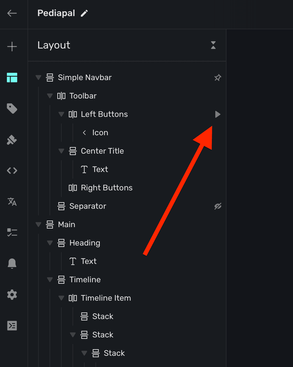
If a component has a tap action associated to it, you'll also see a triangle icon next to it within the sidebar:
Component styling properties
The properties below are editable regardless of which kind of component you are editing. The most important thing to keep in mind is that all of the properties below will work the same as they would on a web page. When you change these properties, behind the scenes — Superwall is applying the corresponding CSS code to the paywall.
Typography
Edit the text, size, color and more of a component's text:
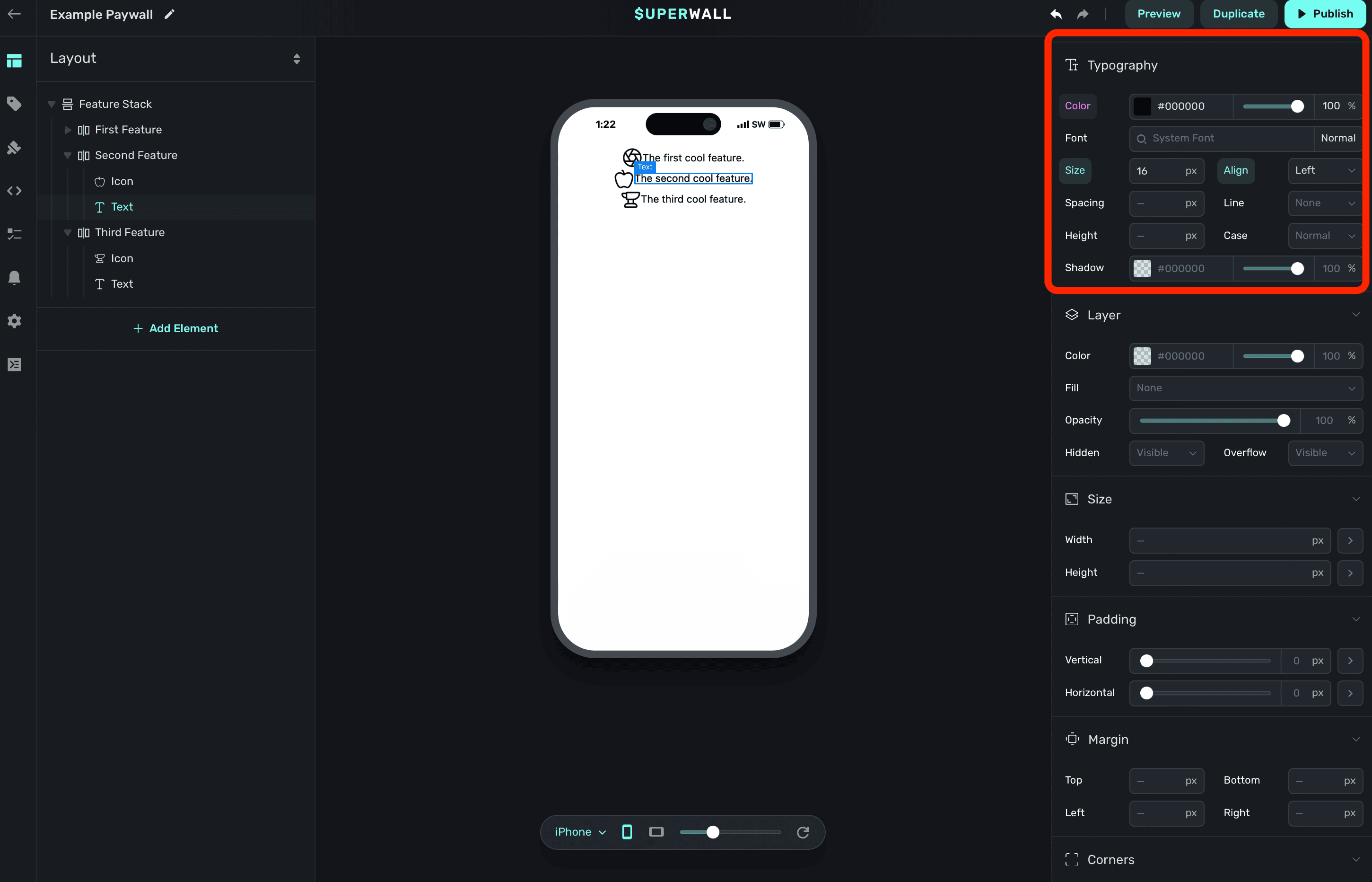
If you've added a custom font, you can also select it here.
Layer
Properties here edit the underlying layer of the component:
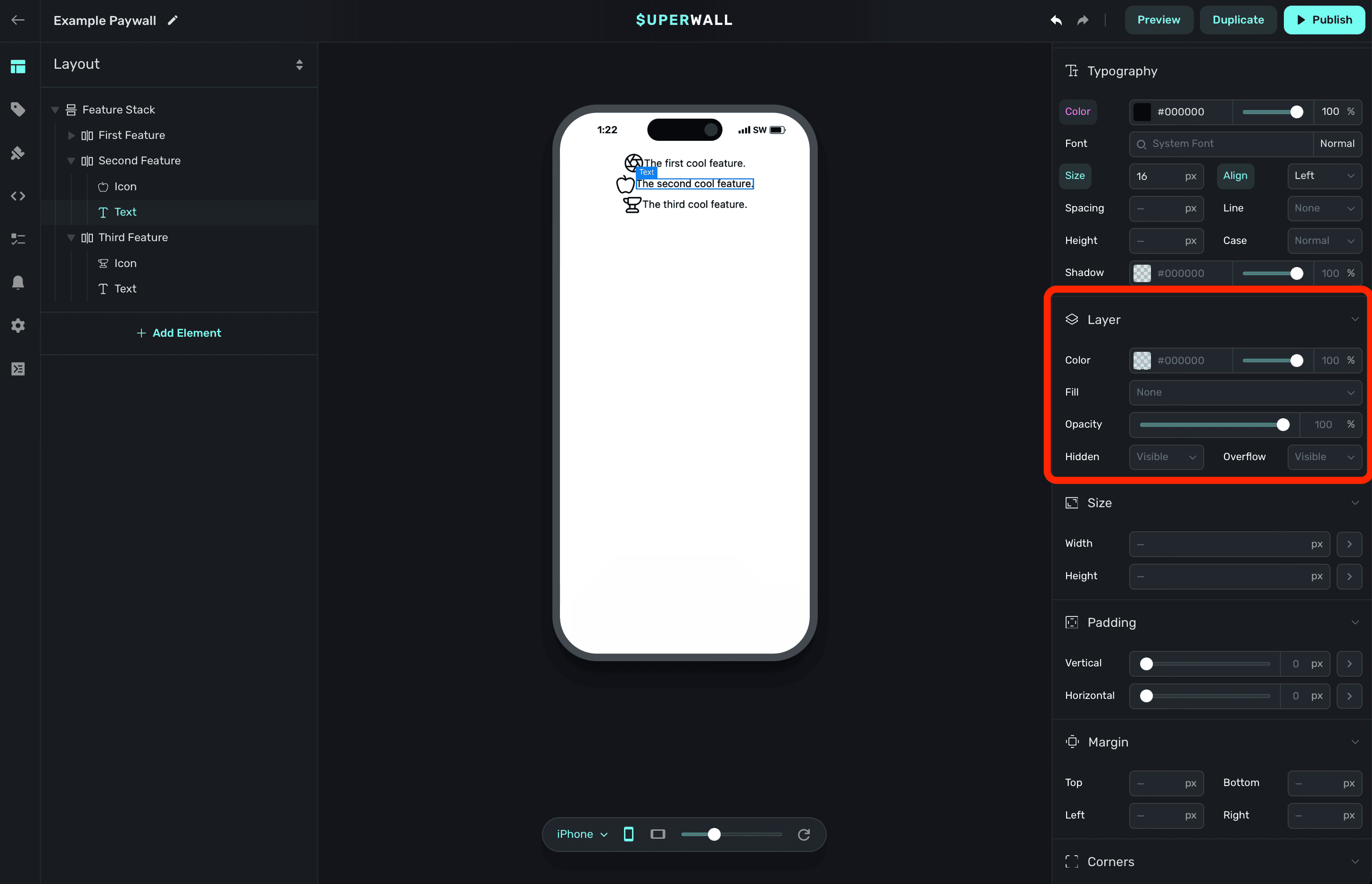
If you want a background fill, to toggle its overall opacity or other similar things — the layer is a great spot to do it.
Size
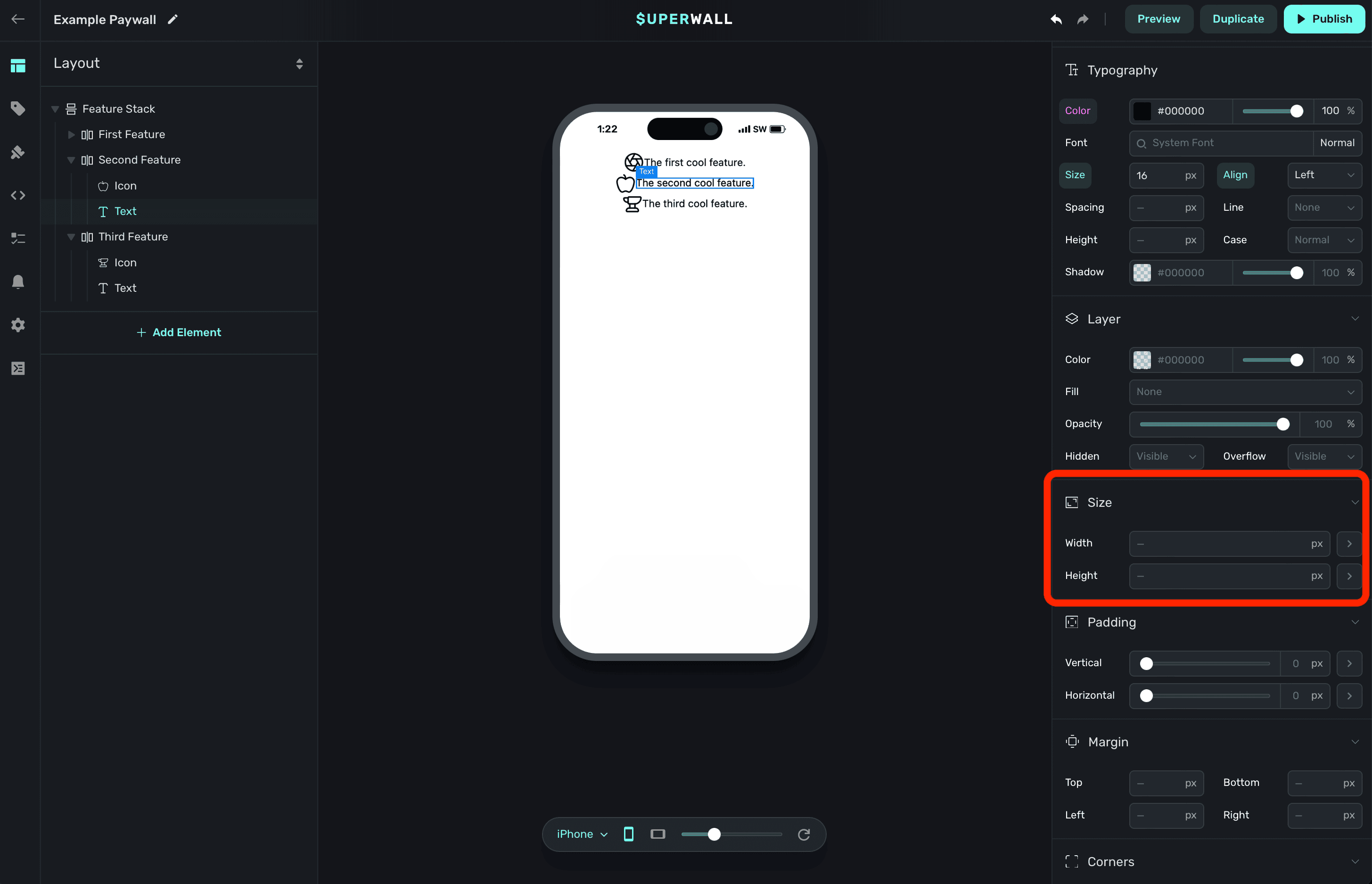
Use size properties to set an explicitly width or height on the component:
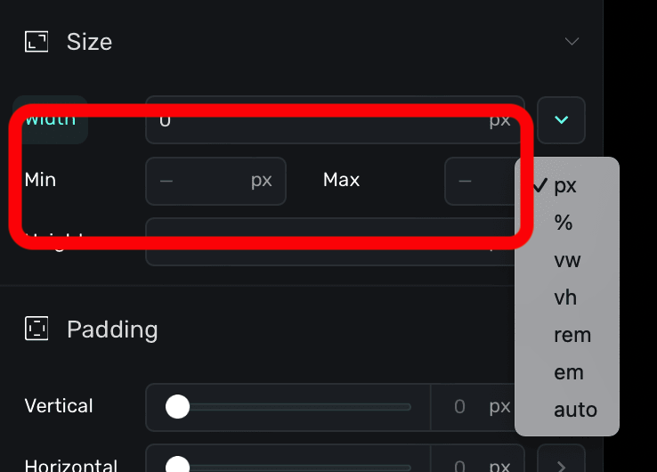
Using the dropdown arrow, you can set a range of minimum and maximum values:
Padding
Apply padding to the content within the component:
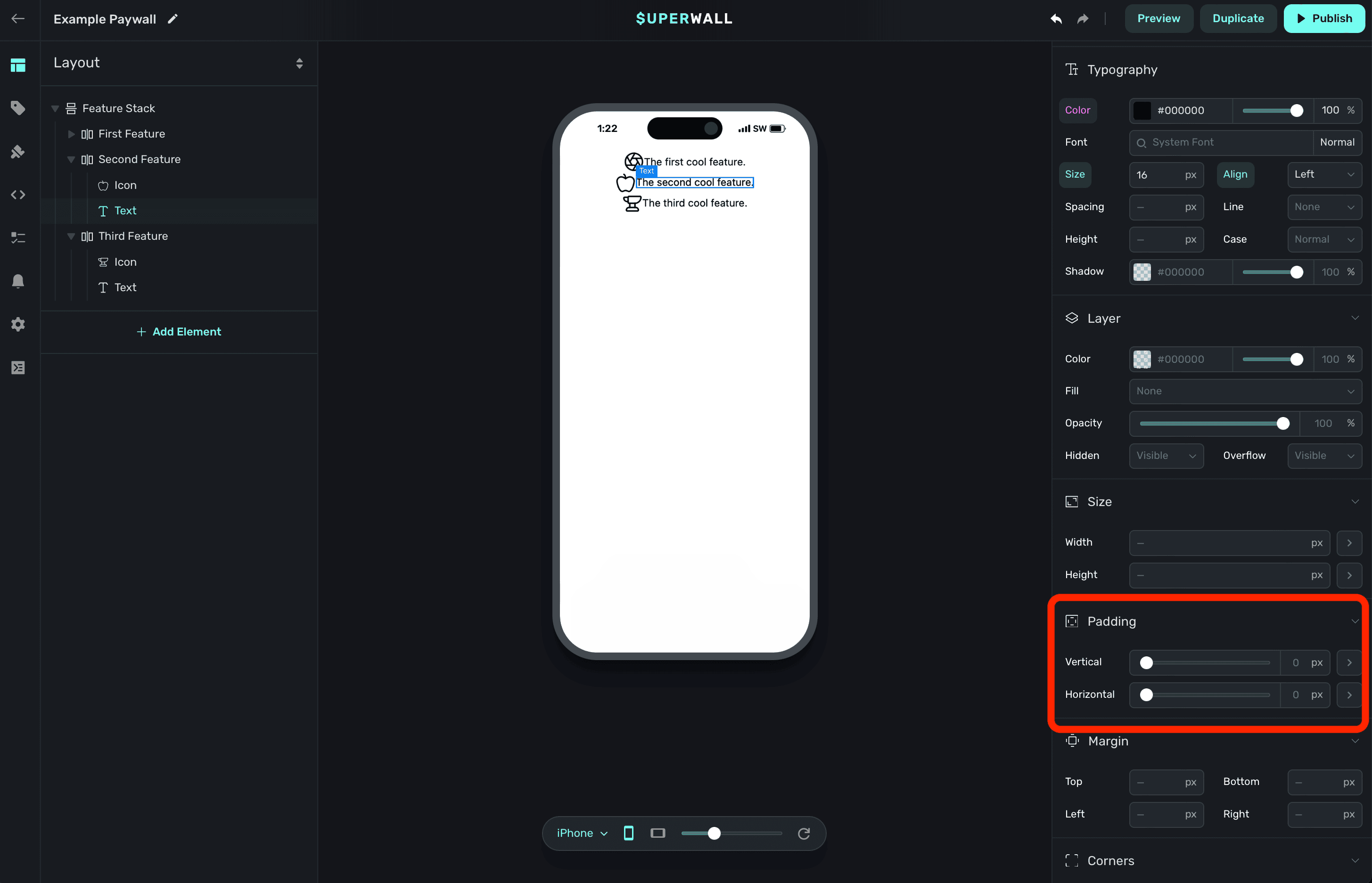
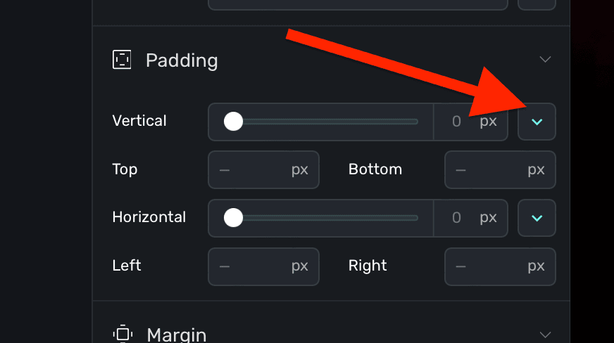
To have more granular control, expand each disclosure arrow to set only the top, bottom, left or right padding values:
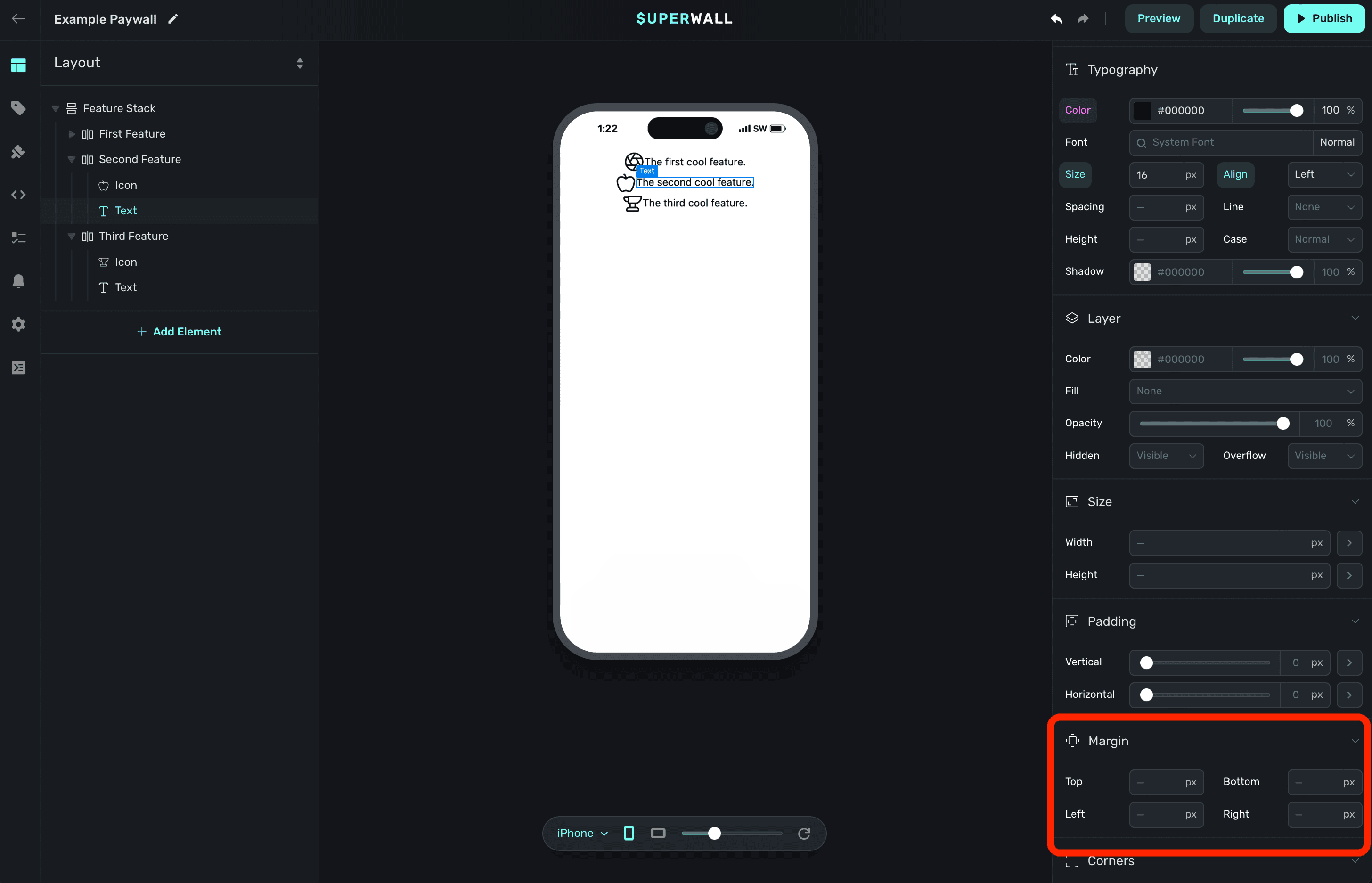
Margin
Apply spacing to the content outside of the component, further separating it from adjacent components:
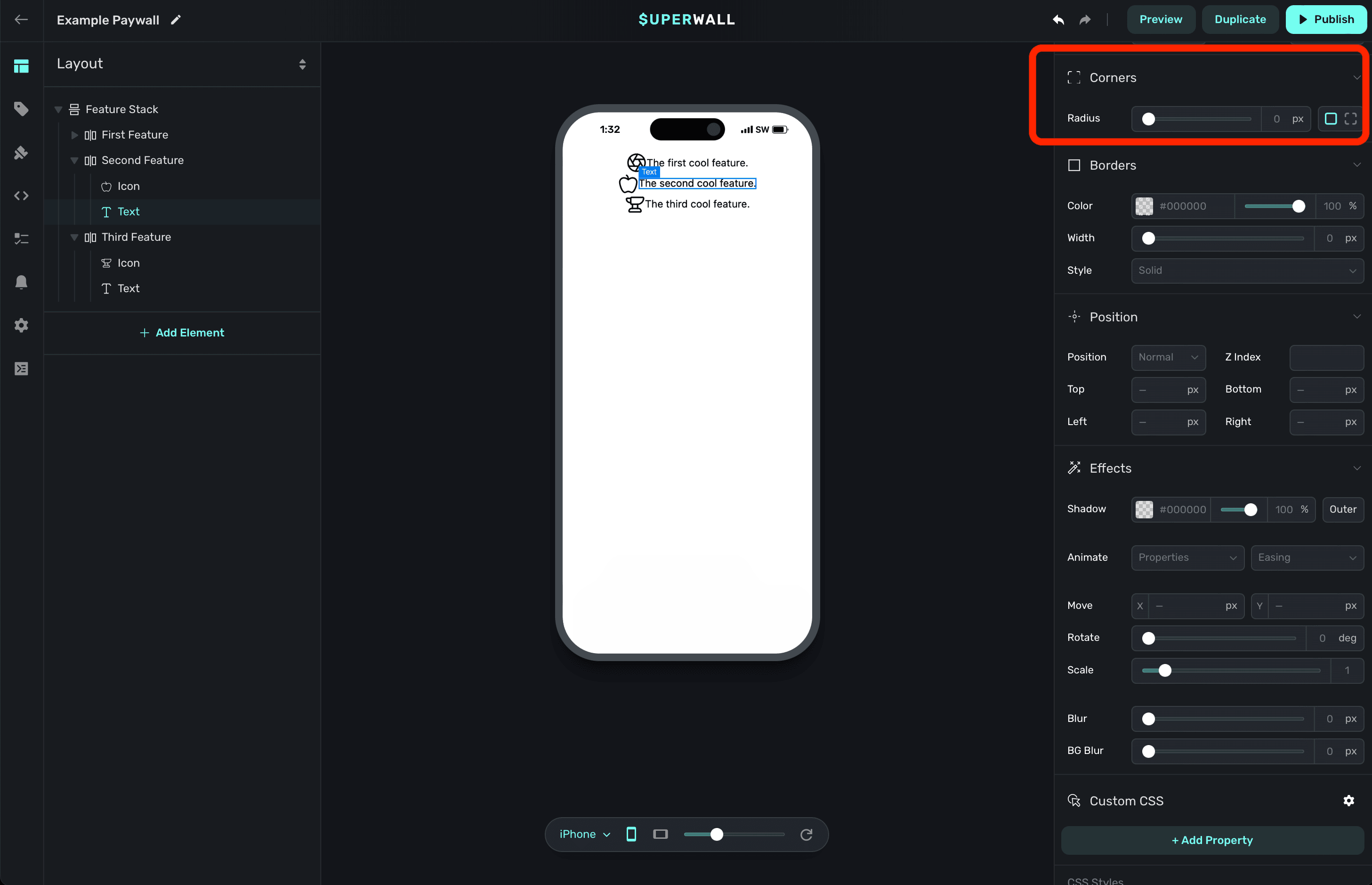
Corners
Applies a corner radius to the component:
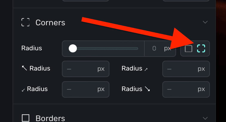
Note that you may not see any change unless the component has some sort of background or layer fill. Further, if you'd like to adjust just one or more corners, click the dashed square icon to individually enter values:
Borders
Set a border around the the component:
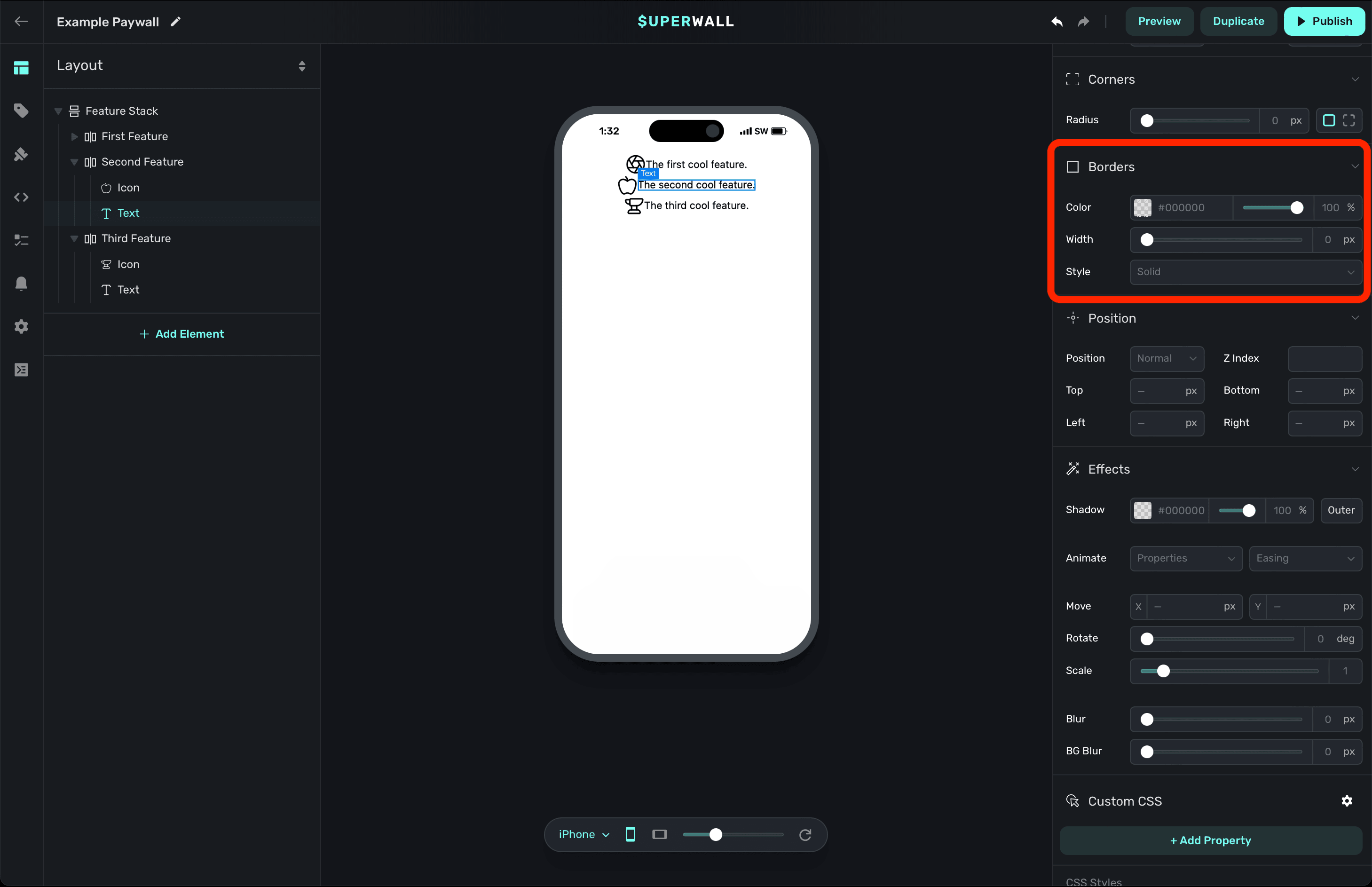
You can set its width, style (i.e. dashed, solid, etc) and more.
Position
Specifies the position strategy used to place the component:
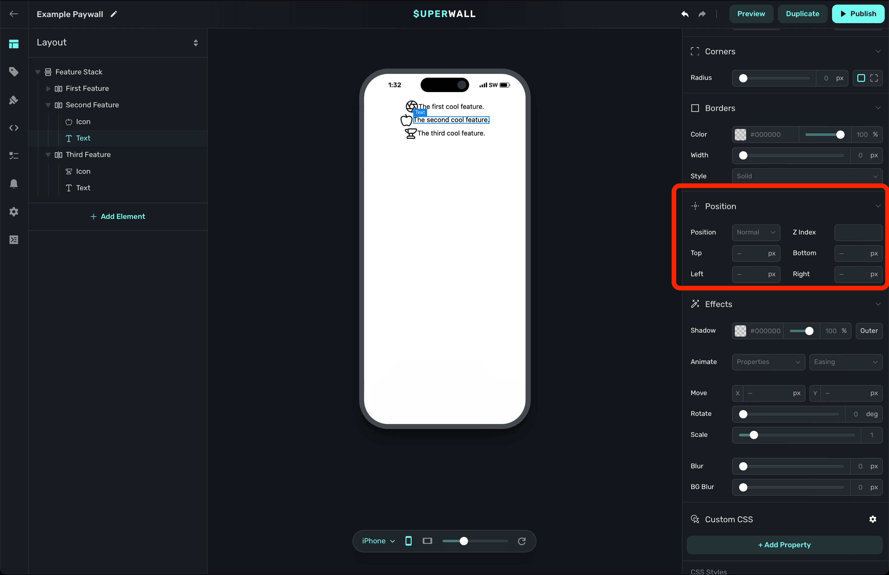
If you'd like to layer a component on top or below another component, the Z Index value is perfect here.
The most important value is what you use for position. Again, all of these options mirror their CSS counterpart. The available options are:
- Normal: The default option. The component will be positioned according to the normal flow of the paywall's hierarchy. This is analogous to
staticin CSS. - Relative: Positions the component relative to its normal position, allowing you to move it with top, right, bottom, and left offsets without affecting the layout of surrounding components.
- Absolute: Removes the component from the normal paywall hierarchy flow and positions it relative to its nearest positioned component (which won't necessarily be a parent component).
- Fixed: Positions the component relative to the viewport, meaning it will stay in the same place even when the paywall is scrolled.
- Sticky: The component will behave as if it has a
normalposition until it teaches a certain point in the viewport. Then, it acts like it has afixedposition, sticking in place. This is great for sticky headers,footers or banners.
Mozilla has excellent developer docs over how the position CSS property works, along with interactive code samples. If you're having some issues getting things placed how you'd like, this is a great resource to check out.
Effects
Applies CSS effects to the component:
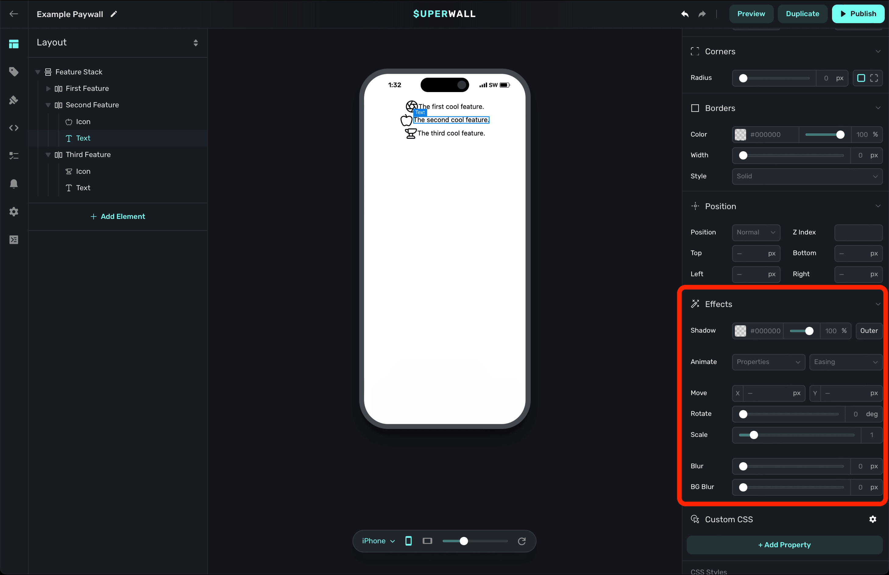
If you're new to CSS transitions and animations, check out this interactive reference.
Custom CSS
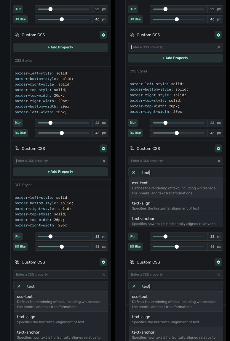
If you need to add some one-off custom CSS code, you can add them here. Just click + Add Property:
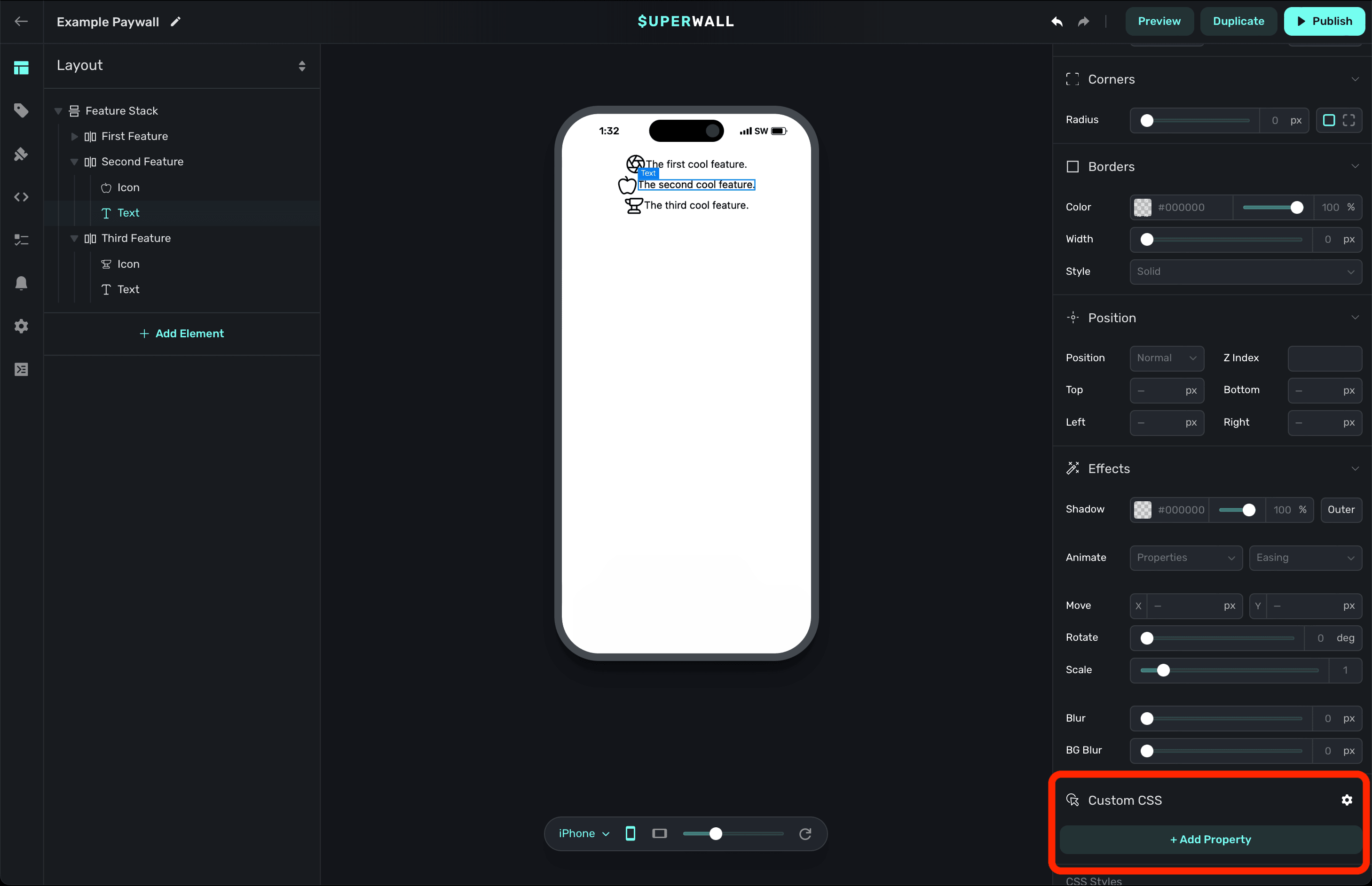
From there, type in the CSS property you need and select it from our dropdown menu:
Here, you can see a manually set background value for the selected component:
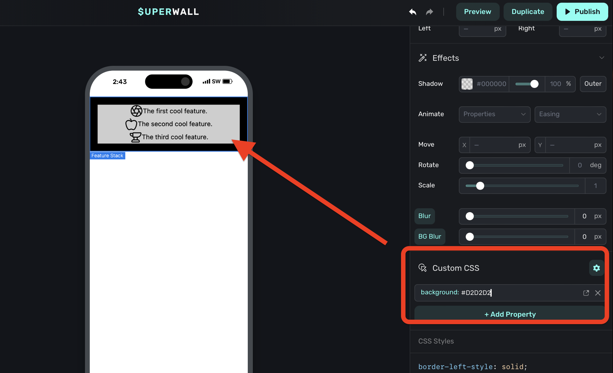
Using the Custom CSS section should be your last step, and only if you absolutely cannot achieve
the design you need. For example, here we should simply use the layer section to set a
background color.
CSS Output
As you make any changes to these properties, you can see the actual CSS that Superwall is applying by scrolling down in the component editor to the CSS Output section:
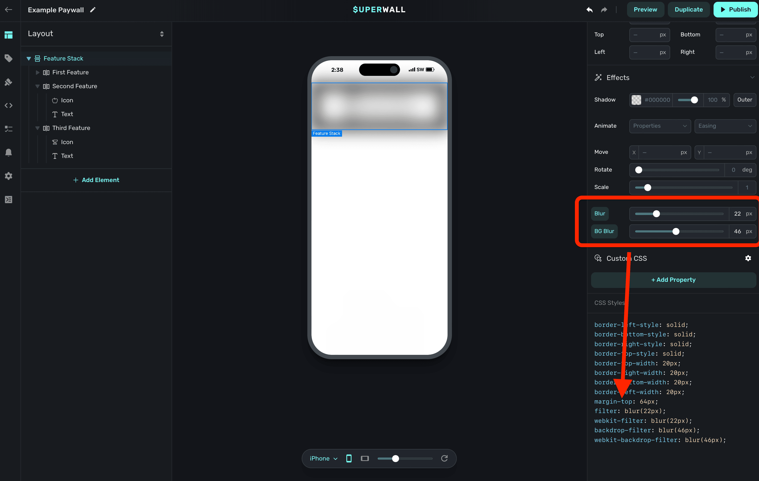
This can be useful for debugging or further refining your designs.
How is this guide?