Theme
To configure a paywall's theme, click the Theme button in the sidebar:
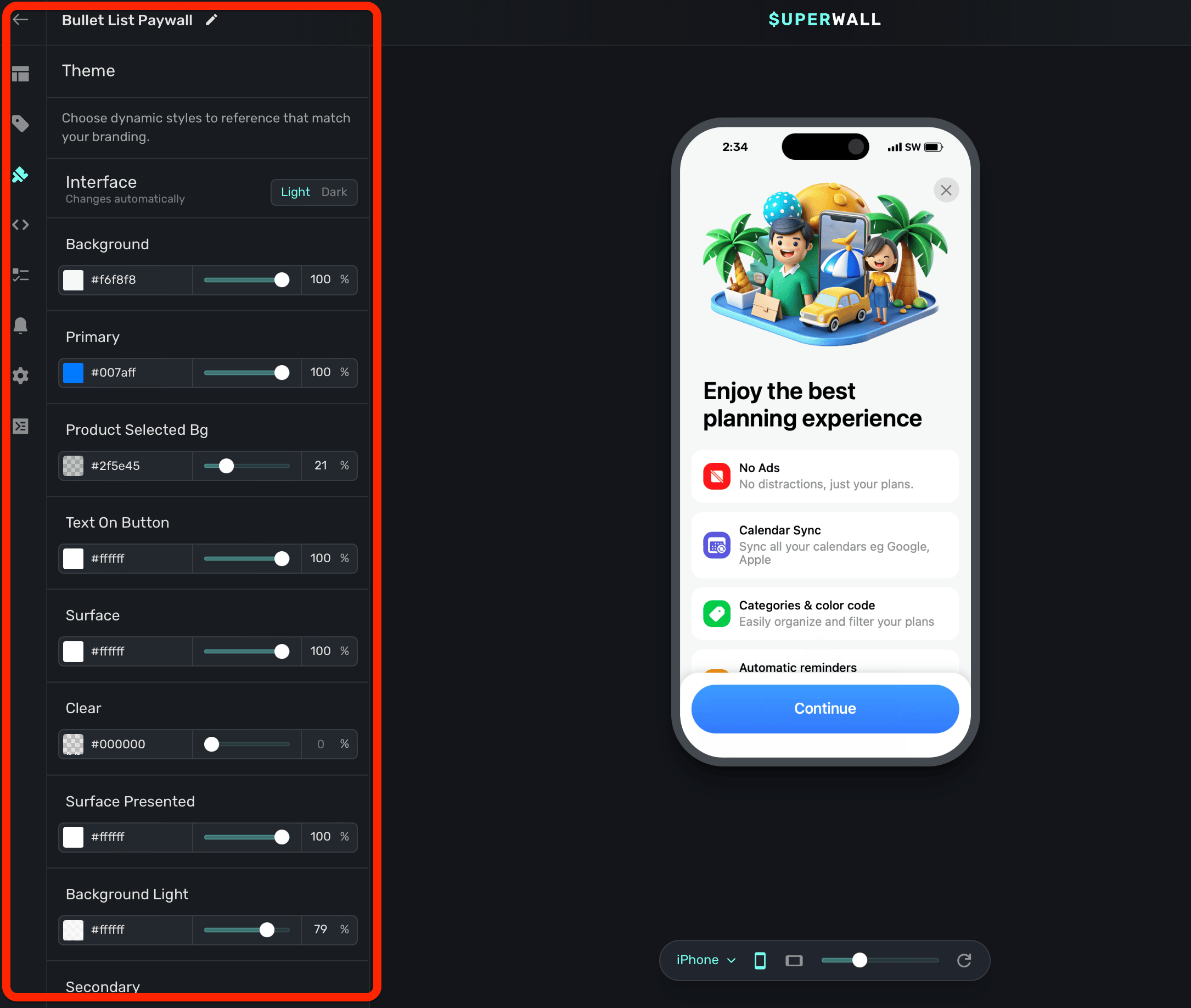
The theme options let you control the overall styling of your paywall. For example, you can change the background color, your primary color, and more. In addition, you can add your own variables to a theme to reference throughout your paywall's components.
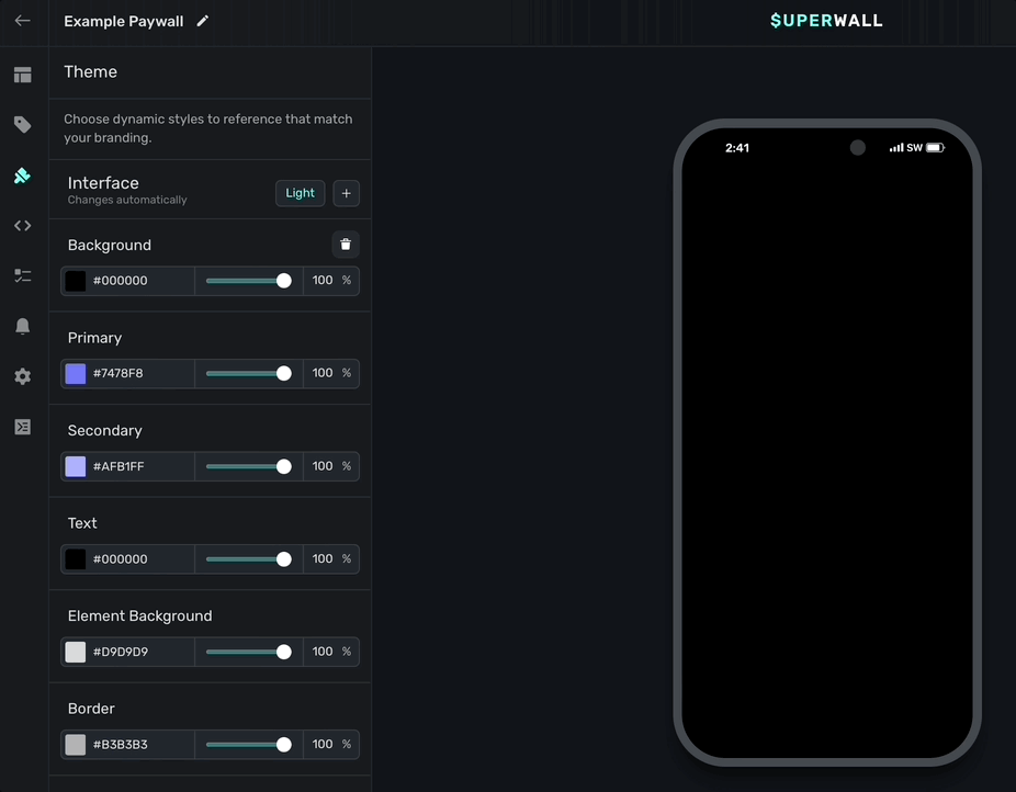
primary color to your brand's prominent color.For example, notice how the entire background of the paywall changes when the background theme is changed from black to white:
Remember, these are variables, so while some of them like background immediately reflect their changes, most of them will be referenced by you within a component. For example, if you wanted to reference the default padding variable under the "Device size" section, you would:
- Select a component.
- Hover over the padding value you want to change (i.e. horizontal, vertical, individual values, etc.)
- Hold the
optionoraltkey and click Edit. - Select padding to apply it.
Here's what that example would look like:
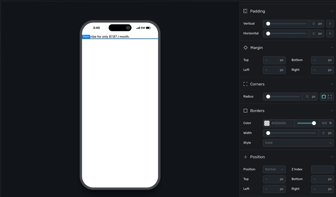
Notice how the "padding" button now displays as purple, indicating it's referencing a variable.
There are three main theme groups for variables:
- Interface: These variables change automatically depending on the interface style of the device.
- Device size: These variables change automatically depending on the device size.
- Theme: Variables added here are static, and by default there is variable for a font choice.
Interface
Use the Interface toggle to have your theme values be reflected in either light or dark mode. Any values you set will only apply when the device's interface theme matches the selected choice (i.e. light or dark).
By default, Superwall has all of your theme apply to both light and dark mode. But, if you click the + icon you can add dark mode specific values, too:
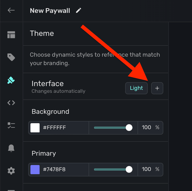
Superwall will copy all of your theme values over to the dark interface style, and from there you can customize them specifically for dark mode.
Superwall provides three interface theme variables out of the box:
- Background: The fill color of the paywall's background.
- Primary: The fill color of core component layers, like a button.
- Text: The text color.
However, you are free to add as many different theme variables as you need. Read below under "Creating theme variables" for more.
Device Size
You can tailor variables to react to a device size. There are a total three different device sizes:
- Small: Typical iPhone device size in portrait.
- Medium: Typical iPhone device size in landscape, or a tablet in portrait or landscape.
- Large: Devices such as a desktop or laptop.
You can see the device preview change size as you toggle through the sizes:
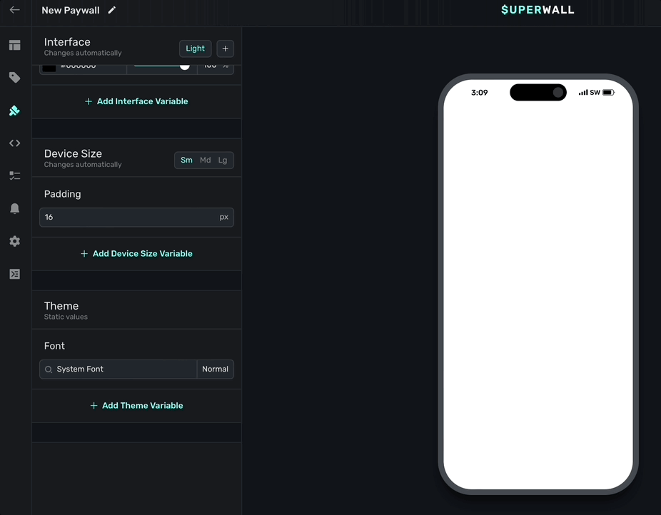
By default, Superwall uses the small device size. Simply click the + button to add more. By default, Superwall provides a padding device size variable:
- Padding: A default padding of 16 pixels you can apply to components by referencing this variable.
Theme static values
Variables you add here are static, meaning they don't react to device parameters and update their values. This is useful for thing you likely want to stay the same, regardless if light or dark mode is on, no matter the size of the device, etc.
Superwall provides a font static variable. Use it to set a default font to use for any text component.
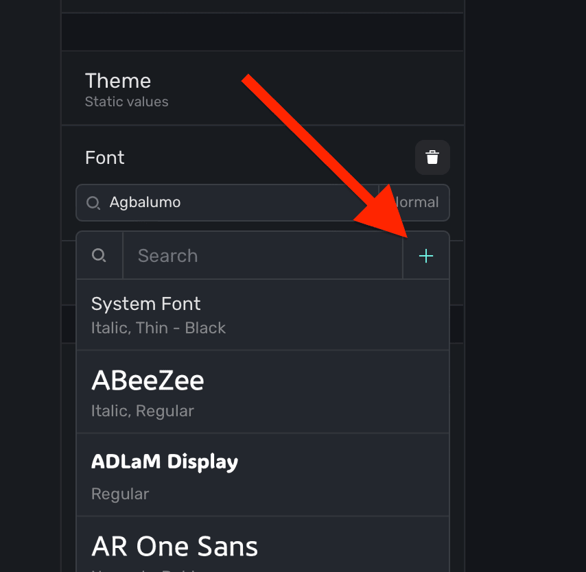
Custom fonts
Using the default font variable, you can also add a custom font. Click the + button in the font variable to add one:
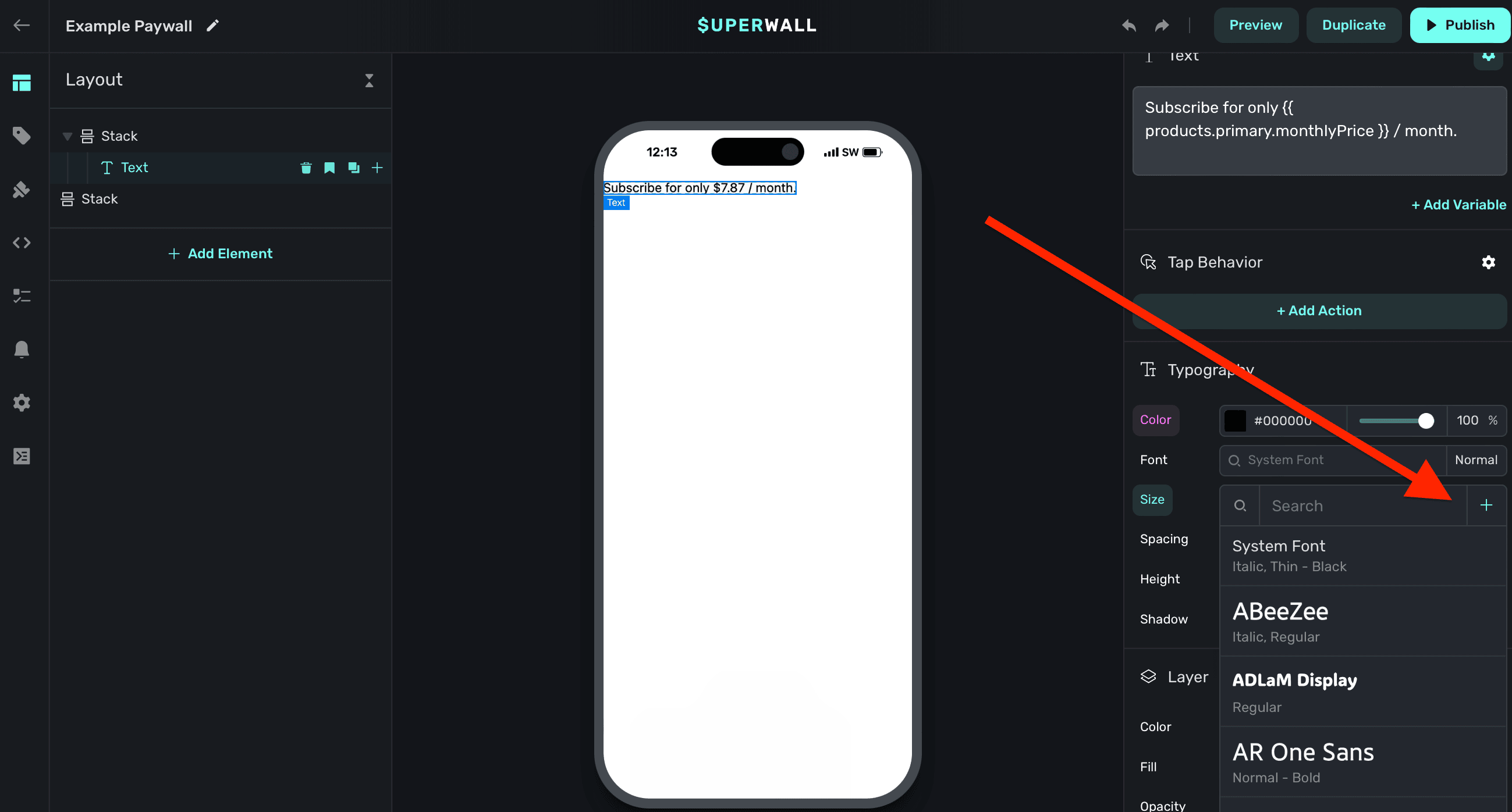
Additionally, you can add a custom font by selecting a text component, and under the Typography section in the component editor, click the + button:
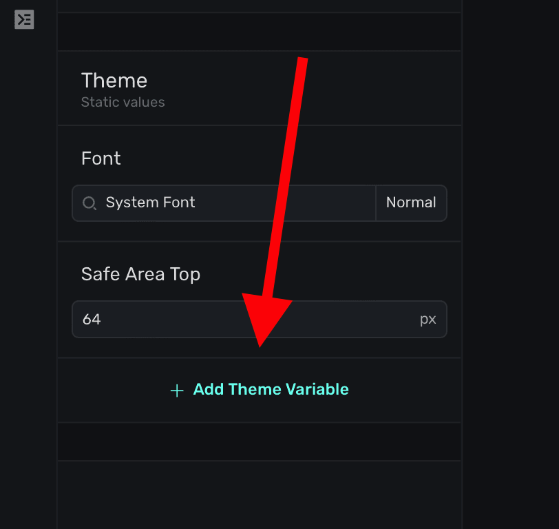
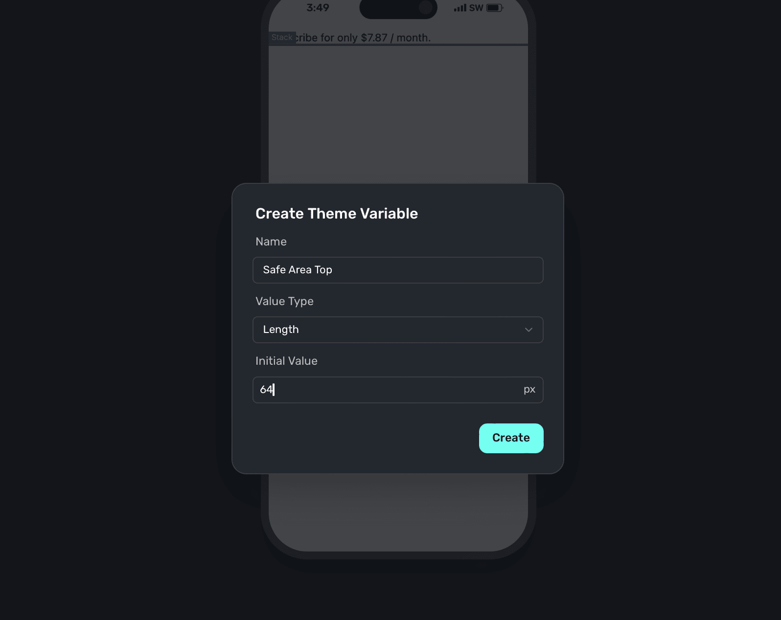
Creating theme variables
To add your own theme variable, click + Add Theme Variable:
There are three different types you can add, all of which use CSS under the hood:
- Color: Set up a color variable using a color picker.
- Length: Set up a length variable using a value of either pixels, a percent, viewport values and more.
- Font: Set up a font variable using the font picker.
Once you've given it a name, value type and initial value, click Create to begin using it:
How is this guide?