Stacks
From a component standpoint, stacks are the foundation of every layout. Most components and snippets will start with a stack. Under the hood, they mimic a flexbox layout.
If you are new to CSS Flexbox, try out this interactive tool. Or, simply change the properties in the editor to see realtime changes.
Stack Specific Properties
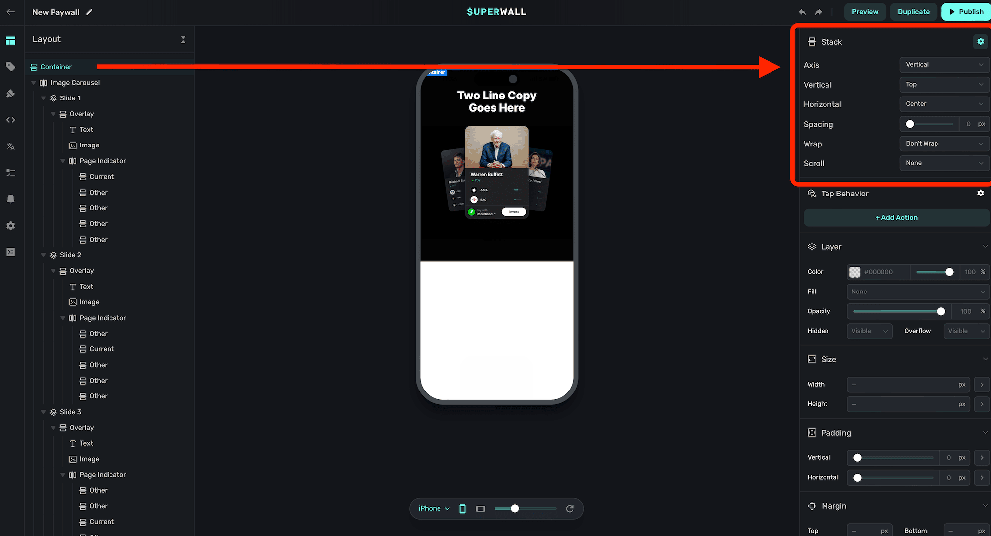
Stacks have unique properties:
-
Axis: Determines the arrangement of items within the stack.
Horizontal: Items are arranged left to right.Vertical: Items are arranged top to bottom.Layered: Items are stacked on top of each other.
-
Vertical: Controls the vertical alignment of the items within the stack.
Top: Aligns items to the top of the container.Center: Aligns items vertically in the center of the container.Bottom: Aligns items to the bottom of the container.Stretch: Stretches items to fill the vertical space of the container.Baseline: Aligns items according to their baseline.
-
Horizontal: Controls the horizontal alignment of the items within the stack.
Left: Aligns items to the left of the container.Center: Aligns items horizontally in the center of the container.Right: Aligns items to the right of the container.Fill Equally: Distributes items evenly across the container, filling the space equally.Space Evenly: Distributes items with equal space around them.Space Around: Distributes items with space around them, with half-size space on the edges.Space Between: Distributes items with space only between them, with no space at the edges.
-
Spacing: Defines the amount of space between items within the stack, measured in pixels by default.
-
Wrap: Specifies how items within the stack should behave when they exceed the container's width.
Don't Wrap: Items remain in a single line and do not wrap onto a new line.Wrap: Items wrap onto the next line when they exceed the container's width.Wrap Reverse: Items wrap onto the previous line in reverse order.
-
Scroll: Determines the scrolling behavior of the stack.
None: Disables scrolling within the stack.Normal: Enables standard scrolling behavior.Paging: Enables paginated scrolling, allowing users to swipe through pages of items. See "Creating Carousels" below.Infinite: Endless scrolling, items clone and repeat themselves once they reach the end.
-
Snap Position: Defines the position at which items snap into place during paging. Only relevant if
Scrollis set toPaging.Start: Items snap to the start of the container.Center: Items snap to the center of the container.End: Items snap to the end of the container.
-
Auto Paging: Controls whether a carousel's contents should automatically page between items. Only relevant if
Scrollis set toPaging.Disabled: Auto paging is turned off, and items page via user interaction.Enabled: Auto paging is turned on and items will automatically page according to the paging delay.
-
Paging Delay: The duration to automatically advance the slides. Only relevant if
Scrollis set toPagingandAuto Pagingis set toEnabled. -
Infinite Scroll Speed: The amount of pixels per frame that the carousel should advance. Only relevant if
Scrollis set toInfinite.
To see how to use stacks for common designs, check out these pages:
How is this guide?