Carousel
Use Superwall's carousel component to have items automatically progress through slides.
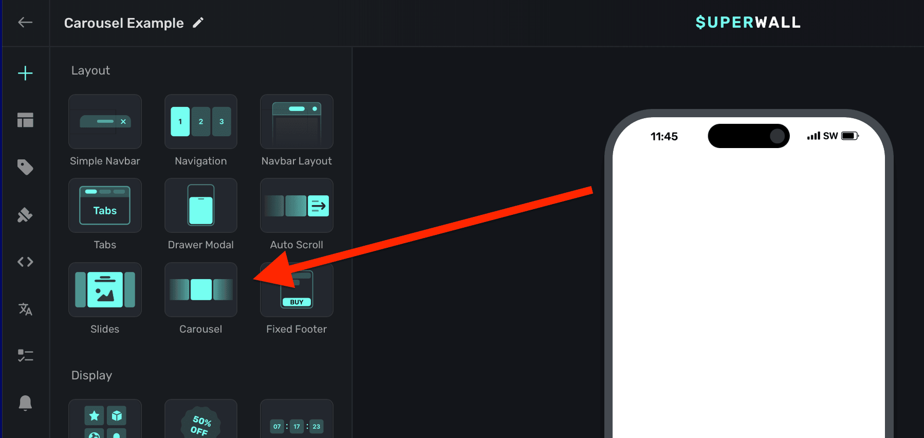
Adding a carousel component
The carousel component was built to make progressing slide designs easy. It's similar to a slides component, except it automatically progresses through its contents instead of being primarily gesture driven. To use the carousel component:
- In the left sidebar, click + to add a new element.
- Choose Carousel under the "Layout" header.
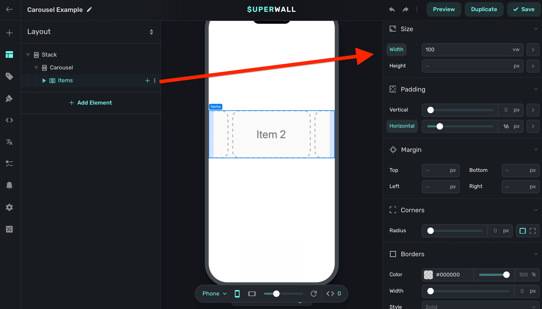
The carousel component requires an explicit width set. Generally, setting this to 100% of the viewport's width works well. This is also the default size set:
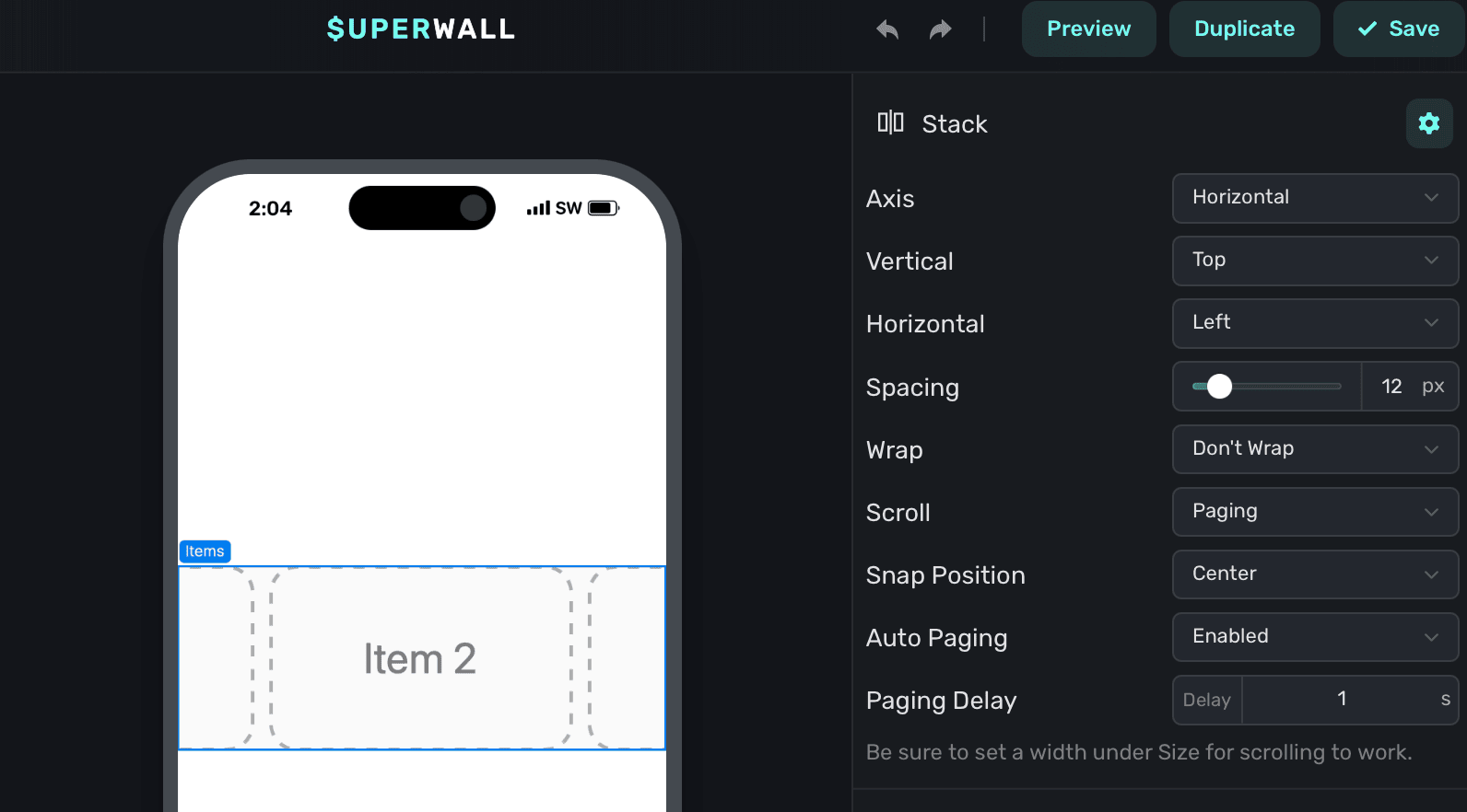
By default:
- The carousel
Scrollproperty is set toPaging. Required. - It's
Wrapproperty is set toDon't Wrap. Required. - The
Snap Positionproperty is set toCenter. Editable. Auto Pagingis set toEnabled. Editable.- Finally,
Paging Delayis intentionally set low to help with designing its content. Set it to a higher value to see the carousel in action.
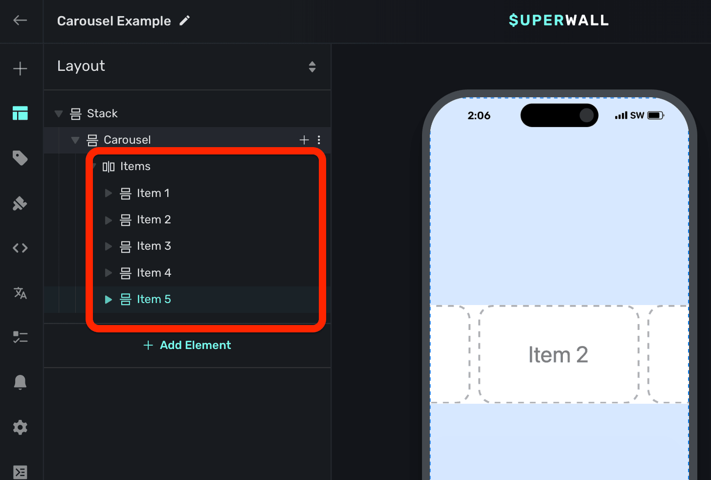
Adding contents to carousels
The carousel component has a few demonstration items added to it by default. You can remove these and add your own content:
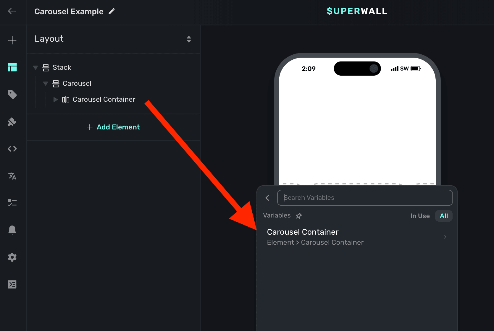
Tracking or updating the displayed element in a carousel
When a carousel element is added, Superwall automatically creates an element variable for it (accessed through the Variables tab in the left sidebar, or the variables button in the floating toolbar). Its name will match whatever is in the element hierarchy in the left sidebar:
You can use this to:
- Select a product based off of the index of the carousel.
- Have a button progress to the next slide.
- Change text using dynamic values based on the index.
- etc.
The variable's name is derived by the node's unique identifier. You don't need to set or generally be aware of this value.
For example, here the button progresses to the next slide by incrementing the slides Child Page Index variable:

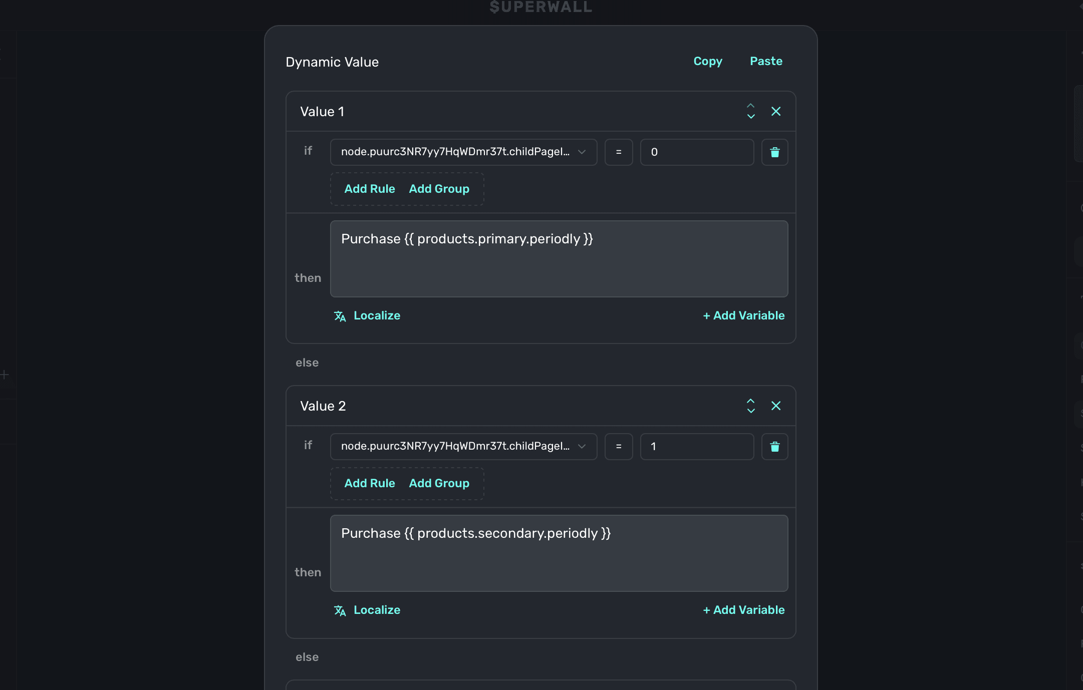
As another example, we could change the text to represent the different product periods we've set up for our fictional products of weekly, monthly and annual. By using a dynamic value, we can simply check which carousel index is showing and change the text accordingly:
How is this guide?