Flow Elements
Add interactive elements to your flows: multiple choice, text entry, progress indicators, and date pickers.
Flows can be enhanced with interactive components designed for multi-page experiences. They capture user input, show progress, or request permissions. Use them to personalize the flow or gather information for branching.
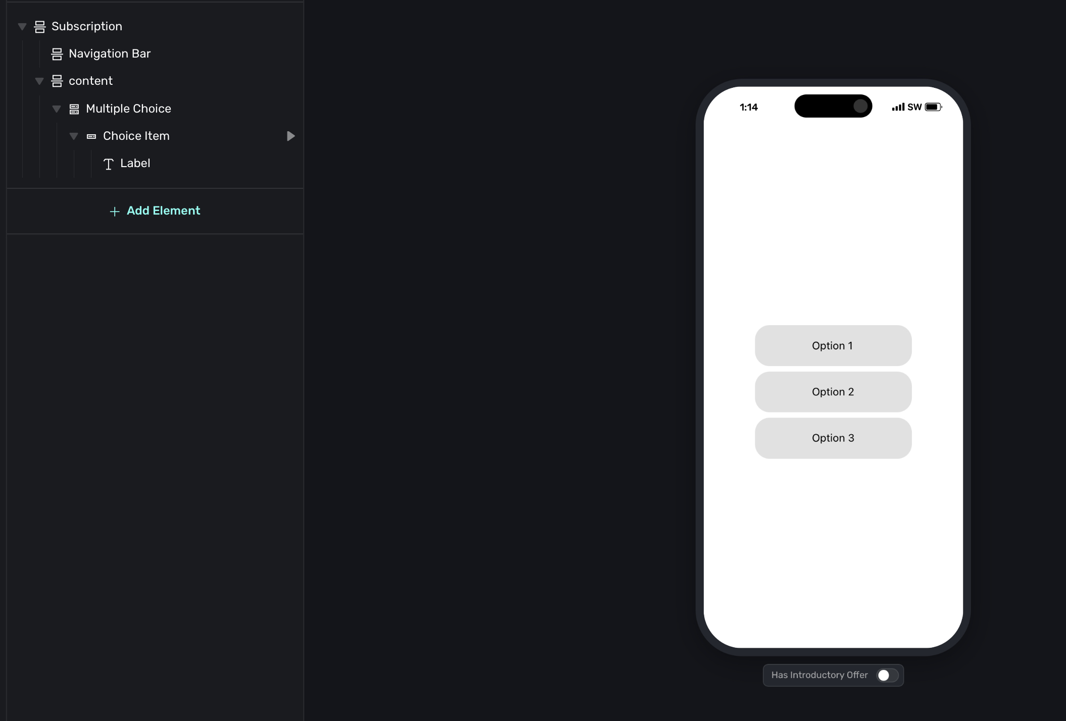
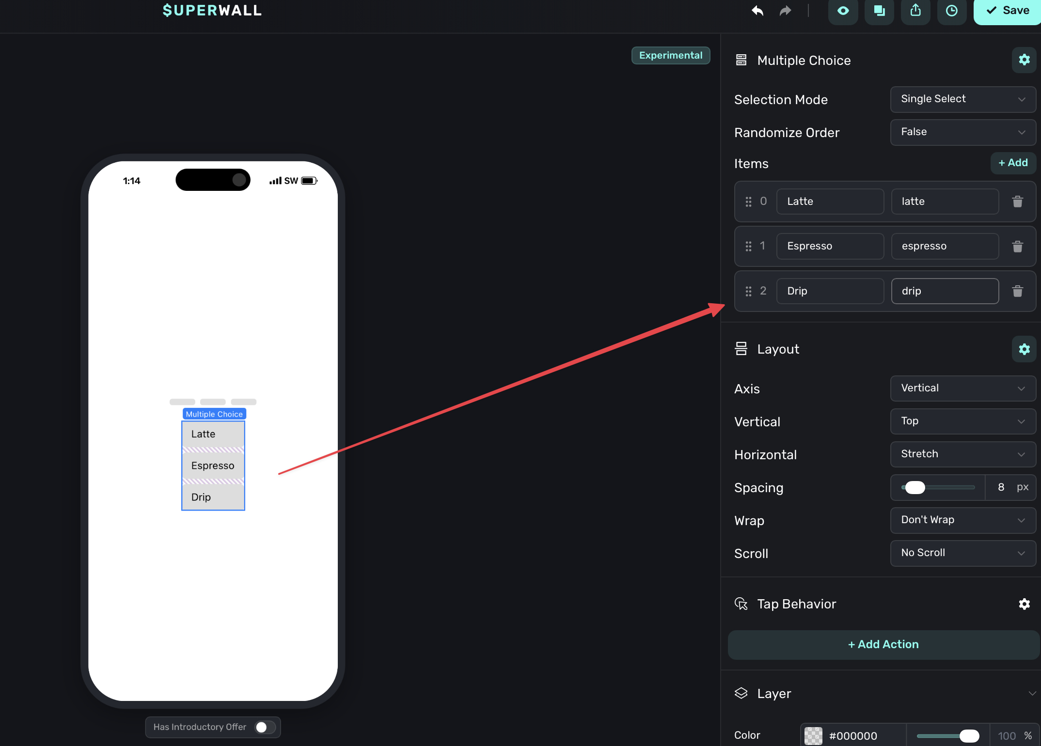
Multiple Choice
The multiple choice element presents options for users to select. This is the key element for enabling branching. User selections can determine which page they see next.
Configuration
- Single-select or multi-select: Choose whether users can pick one option or multiple.
- Randomize order: Shuffle the options each time (useful for surveys to reduce bias).
- Choice items: Each choice has a label and a value.
Labels and values
Each choice has two parts:
- Label: What users see (e.g., "Grow subscriptions").
- Value: What gets stored (e.g.,
goal_grow).
The value is used internally for routing conditions and user attributes. Keep values short and consistent (lowercase, underscores).
Storing selections
When a user makes a selection, two variables are available: selectedValue (the internal value, e.g., goal_grow) and selectedLabel (the display text, e.g., "Grow subscriptions"). If localization is active, selectedLabel returns the translated label for the user's locale.
You can use these in routing conditions to branch the flow, store them as user attributes for analytics or personalization, reference them in dynamic content on later pages, or pass them to your backend via webhooks.
Multiple choice controls are commonly used for branching.
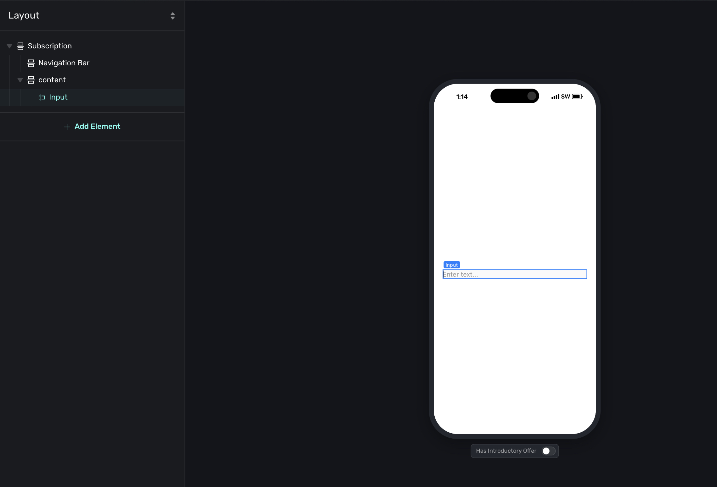
Input
The input element lets users type a response, like their name, email, or feedback.
Configuration
- Placeholder text: The hint shown before users type.
- Keyboard type: Choose the appropriate keyboard (default, email, number, etc.).
Storing responses
Like multiple choice, text entry values can be stored as user attributes. This is useful for personalizing later pages with the user's name, capturing email addresses for follow-up, or collecting feedback or custom responses.
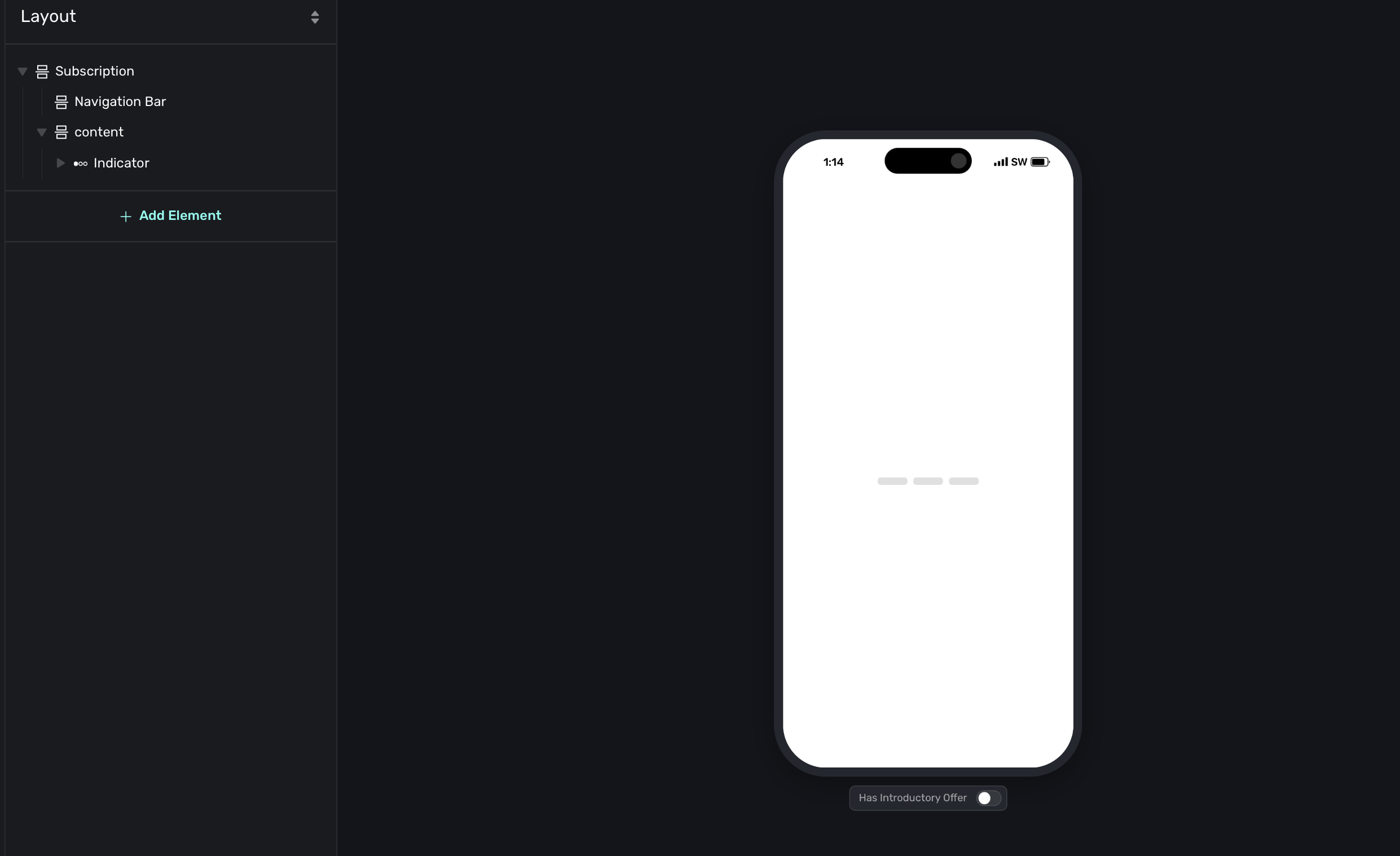
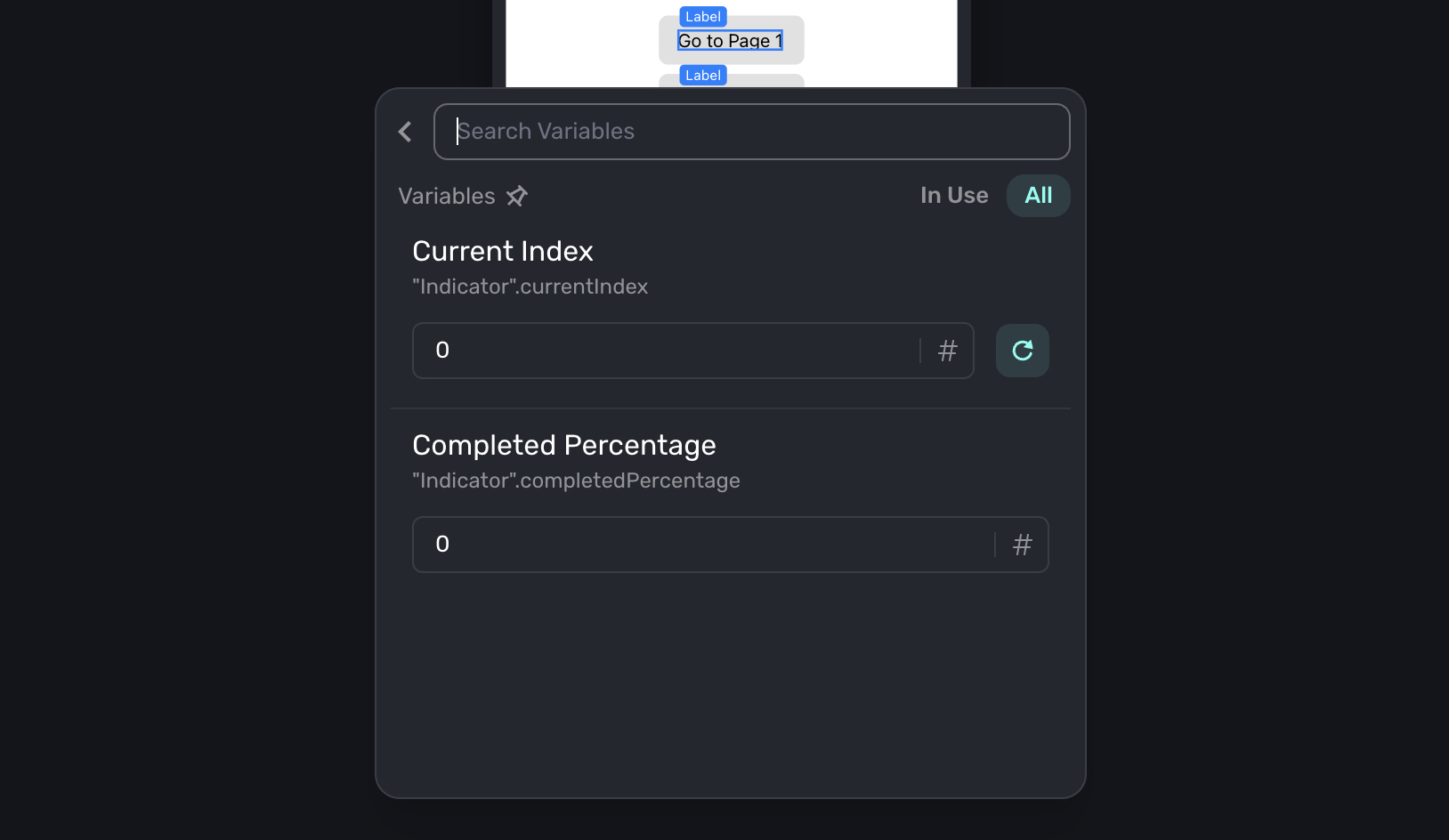
Indicator
The indicator element shows progress through the flow, like "Step 2 of 5."
Configuration
- Style: Choose from different visual styles (dots, bars, numbers).
- Current step: Which step to highlight.
- Total steps: How many steps to show.
Add an indicator when your flow has more than 3-4 pages. Users are more likely to complete a flow when they can see their progress and know how much is left. You can also use their properties in dynamic values such as progression:
Date Picker
The date picker element lets users select a date, time, or both using a scrollable wheel or compact input. This is useful for collecting birthdates, scheduling preferences, or any date-related input during onboarding.

Configuration
- Style: Choose between Wheel (scrollable columns) or Compact (native date/time input).
- Components: Choose what to collect.
- Wheel style supports Date & Time, Date, Time, and Time List (a single scrolling column with pre-formatted time options).
- Compact style supports Date and Time.
- Min Date / Max Date: Constrain the selectable range. Options are No Limit, Today, Relative (e.g., 30 days before or 1 year after today), or a Fixed Date.
- Minute Interval: When using a time component with the wheel style, set the interval between selectable minutes (1, 5, 10, 15, 30, or 60).
Storing selections
The selected value is stored as a string and accessible as a variable. The format depends on what components are configured: YYYY-MM-DD for date, HH:MM:SS for time, or YYYY-MM-DDTHH:MM:SS for date and time. You can use this value in routing conditions, dynamic content on later pages, or pass it to your backend.
How is this guide?