Slider
Let users choose a numeric value or scrub progress directly inside a paywall or flow.
The slider element lets users choose a numeric value by dragging a handle or using keyboard controls. Use it for goals, budgets, intensity controls, percentages, rating scales, and progress scrubbers inside paywalls or onboarding flows.
Use a slider when the user is choosing a number. Use Navigation, Slides, or Carousel when the user is moving between screens.
Adding a slider element
To add a slider element:
- In the left sidebar, click + to add a new element.
- Choose Slider in the Flows section.
If you do not see Slider, flow elements may not be enabled for your workspace yet.
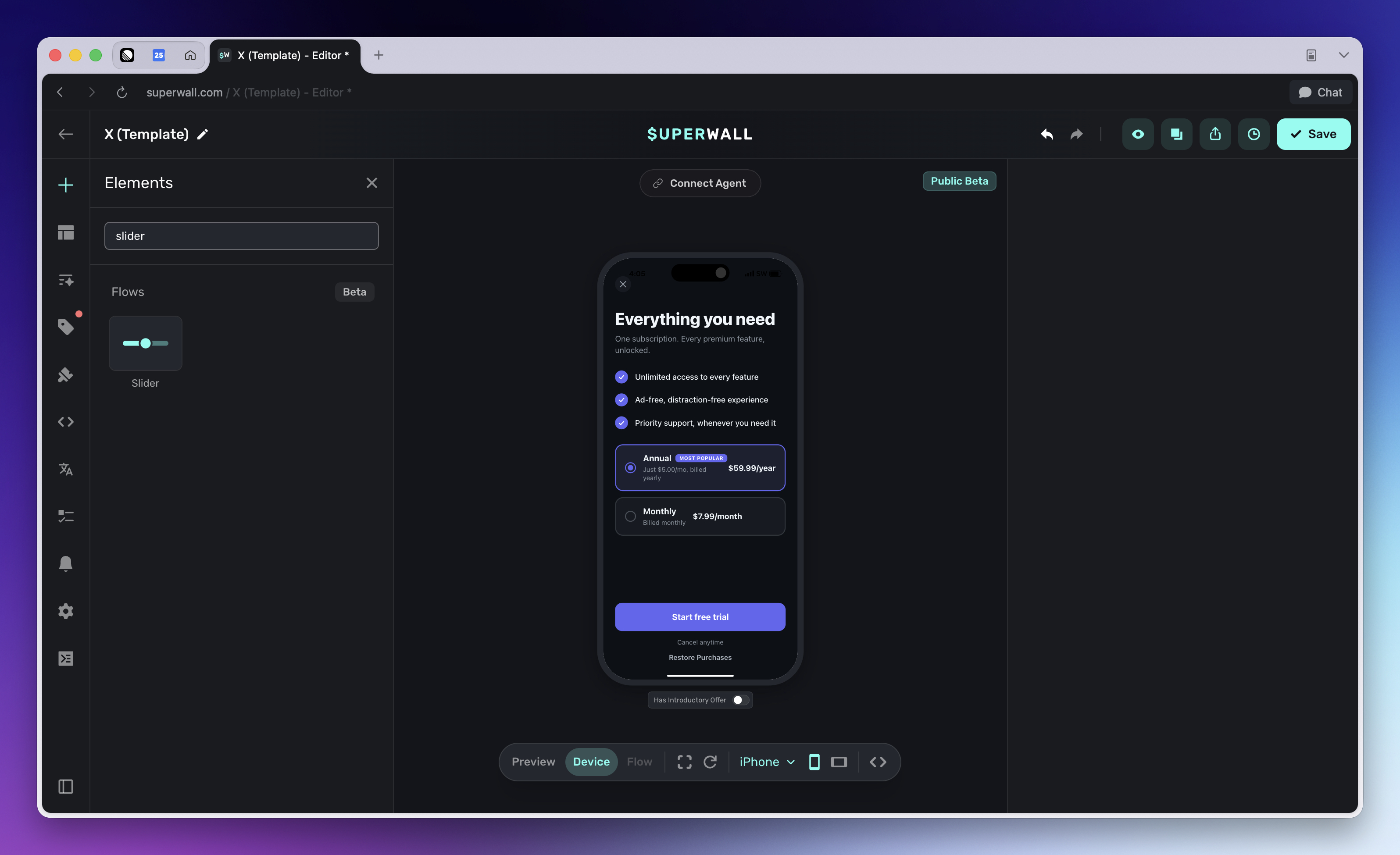
Adding a slider creates a small element group:
- Track: The background stack behind the slider.
- Slider: The interactive filled progress layer. Select this element to edit range, orientation, step size, and fill styling.
- Knob: A stack inside the slider that visually marks the current value.
Keep these elements together unless you are intentionally rebuilding the control. The knob is a child of the slider, so it moves with the filled progress layer as the value changes.
Configure the range
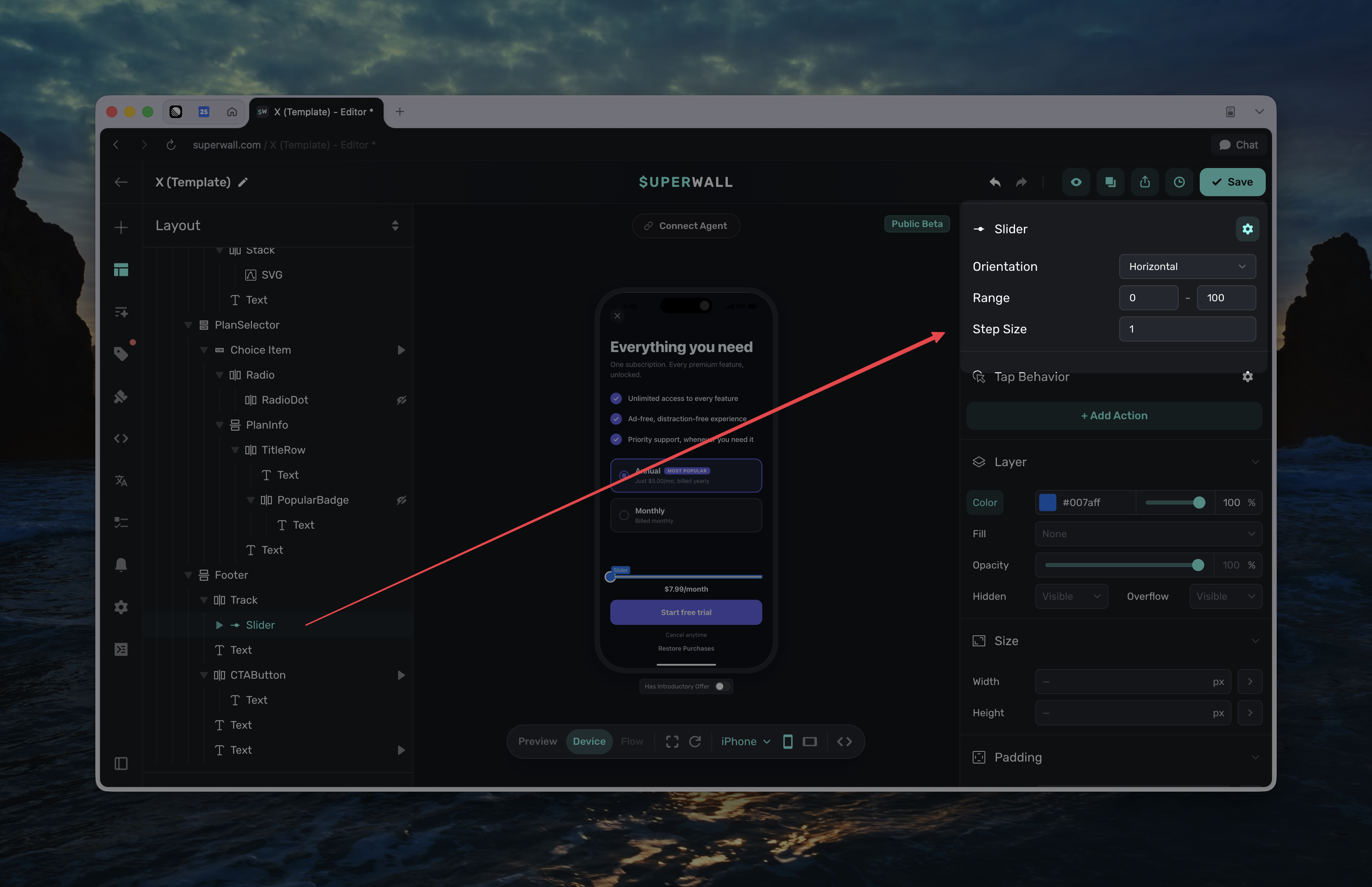
Select the Slider element to configure its value behavior:
- Orientation: Choose Horizontal or Vertical. Horizontal sliders fill from left to right. Vertical sliders fill from bottom to top.
- Range: Set the minimum and maximum allowed values.
- Step Size: Set the increment used while dragging or using keyboard controls. Use
1for whole numbers,0.1or0.01for decimal values, and0only when you need a continuous slider.
The slider starts at its minimum value unless its value variable already has a current or initial value. If the configured range changes later, out-of-range values are clamped visually until the user interacts with the slider again.
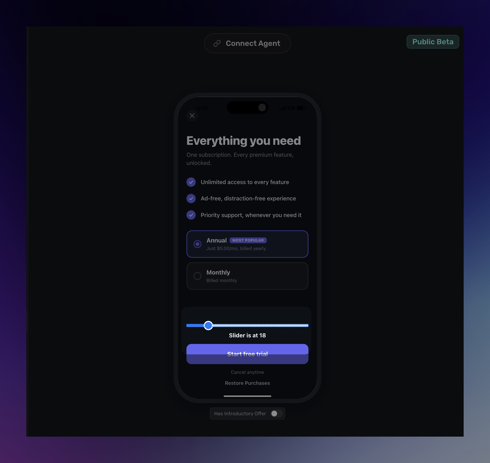
Use the slider value
Every slider exposes a Value variable. You can insert it from the left side Variables menu or from the floating toolbar under Element -> Slider.
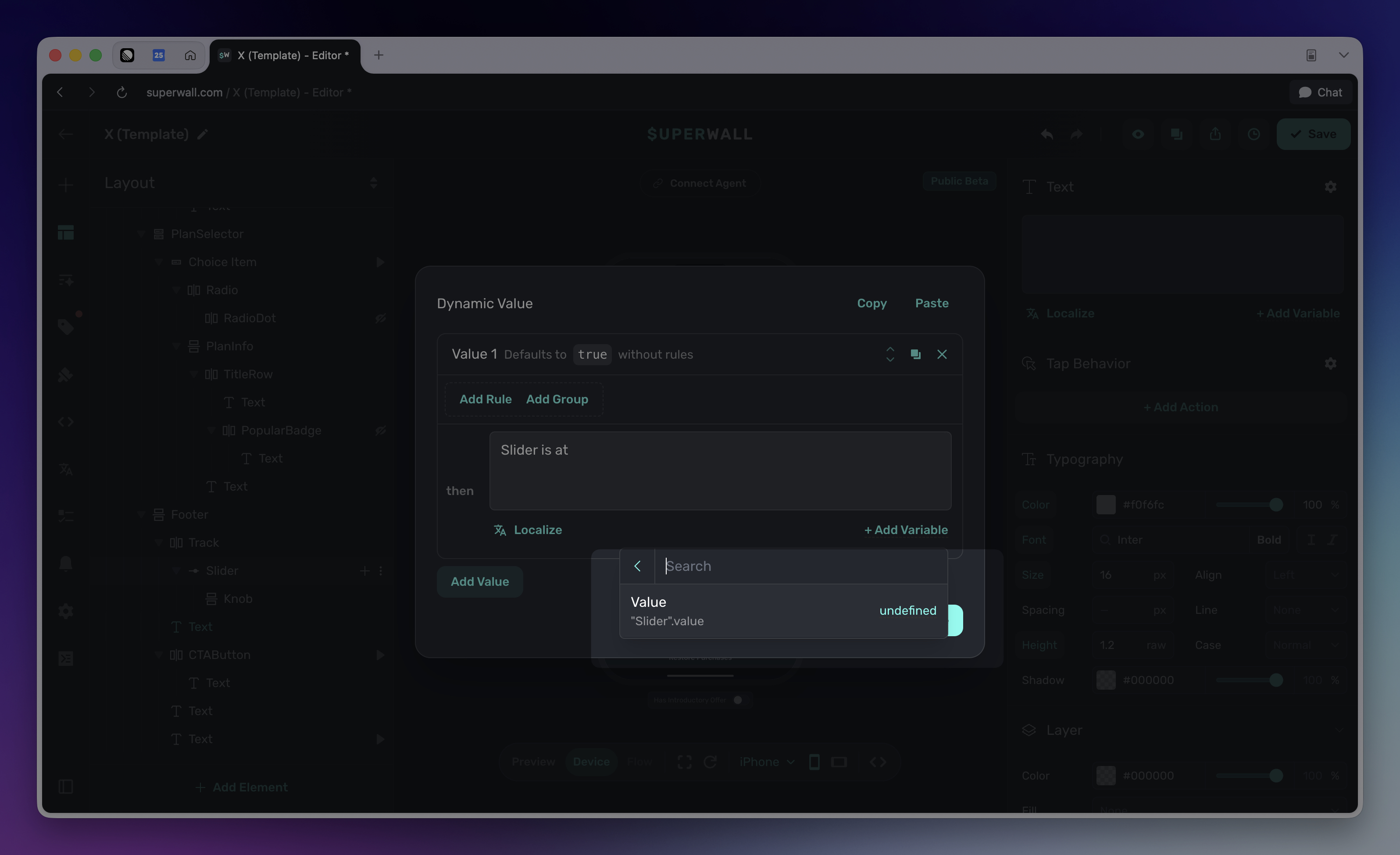
Use the slider value to:
- Show the selected value in text, such as a goal amount, discount percentage, or intensity level.
- Drive dynamic values that show, hide, or restyle elements based on a threshold.
- Branch a flow based on the value the user selected.
- Pass the value into the rest of your paywall workflow when you need to persist or act on the selection.
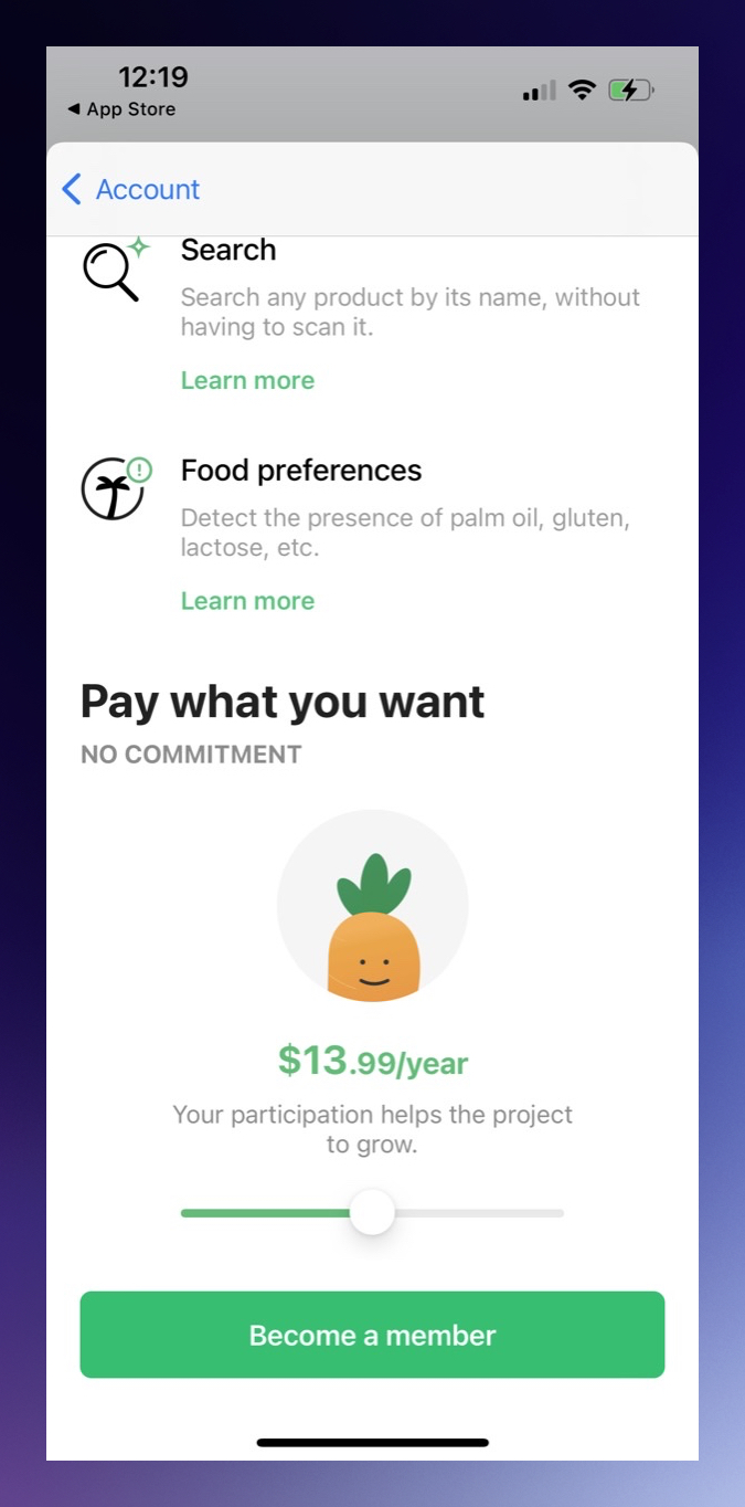
You can use a slider to build a "Customize your price" paywall. Map each slider step to a product, then use the slider value to update which product is selected under the paywall. This lets users drag between price points while the offer copy, displayed amount, and purchase button stay tied to the selected product.
AI Chat and Editor MCP use the native sw-slider element for this control. The underlying value is exposed as state:node.<id>.value, but most editor workflows should insert the value from the variable picker instead of typing the state path manually.
Style the track, fill, and knob
The default slider is built from separate visual pieces so you can style each part independently:
- Select Track to edit the background bar. This is where you usually set width, height, background color, radius, padding, and placement.
- Select Slider to edit the filled progress layer. The slider's background color styles the fill, not the track behind it.
- Select Knob to edit the draggable handle. You can change its size, radius, border, shadow, and color like any other stack.
For horizontal sliders, the fill expands from the left edge. For vertical sliders, the fill expands from the bottom edge. When you switch a slider to vertical orientation, give the track a clear height and reposition the knob so it aligns with the fill edge.
Style the track for the inactive portion of the control, and style the slider element for the active filled portion. If the slider seems invisible at first, it may be at its minimum value, where the fill has zero width or height.
Common patterns
Common slider patterns include:
- Goal selector: Let users choose a target, such as workouts per week, minutes per day, or a savings amount.
- Intensity selector: Let users choose a level, difficulty, or personalization value.
- Percentage selector: Let users choose a discount, completion amount, or progress value.
- Progress scrubber: Let users scrub through a simple before/after or step-based experience.
Troubleshooting
Slider does not appear: Make sure the track has visible styling, the slider has a real width and height, and flow elements are enabled for your workspace.
Only the knob appears: The slider may be at its minimum value, where the filled portion is zero width or height. Drag the knob or set an initial value.
The value changes in the wrong increments: Select the slider and update Step Size.
A vertical slider still looks horizontal: Set Orientation to Vertical, then give the track a clear height and reposition the knob for the vertical fill direction.
Styling the slider changed the fill instead of the track: This is expected. Select Track to style the inactive background, and select Slider to style the active fill.
How is this guide?