Layout
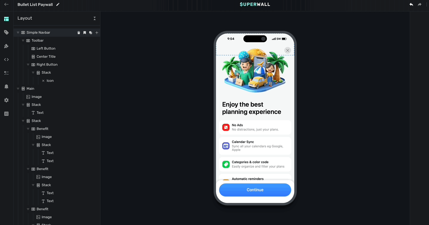
The Layout tab in the sidebar provides a visual outline of your paywall's components. Hovering over elements will highlight them in the device preview:
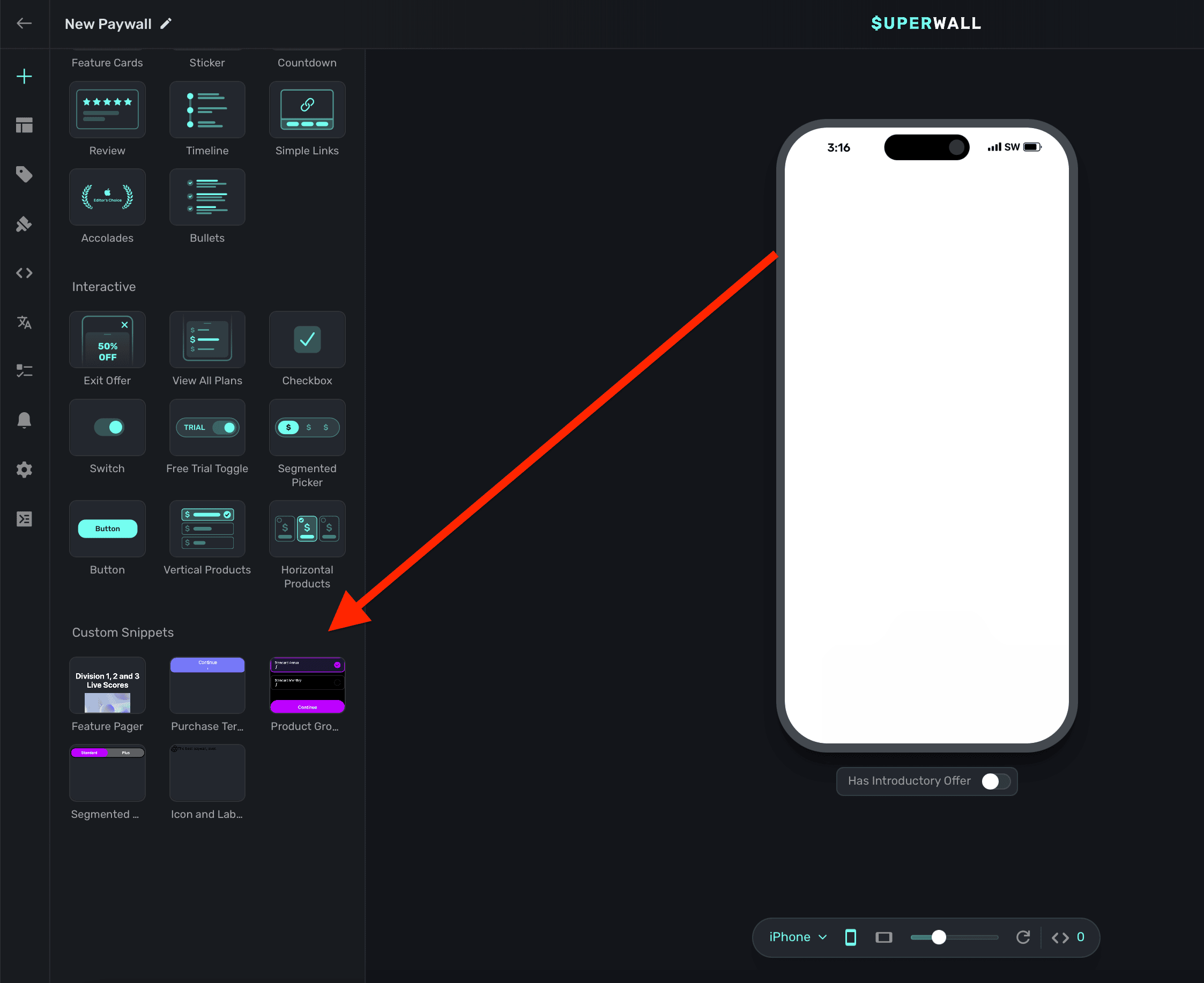
Adding elements
Click the + in the left sidebar or in the Layout tab to select an element to add to your paywall. This will present our library of components along with any snippets you've made (along with some of our own stock recipes):
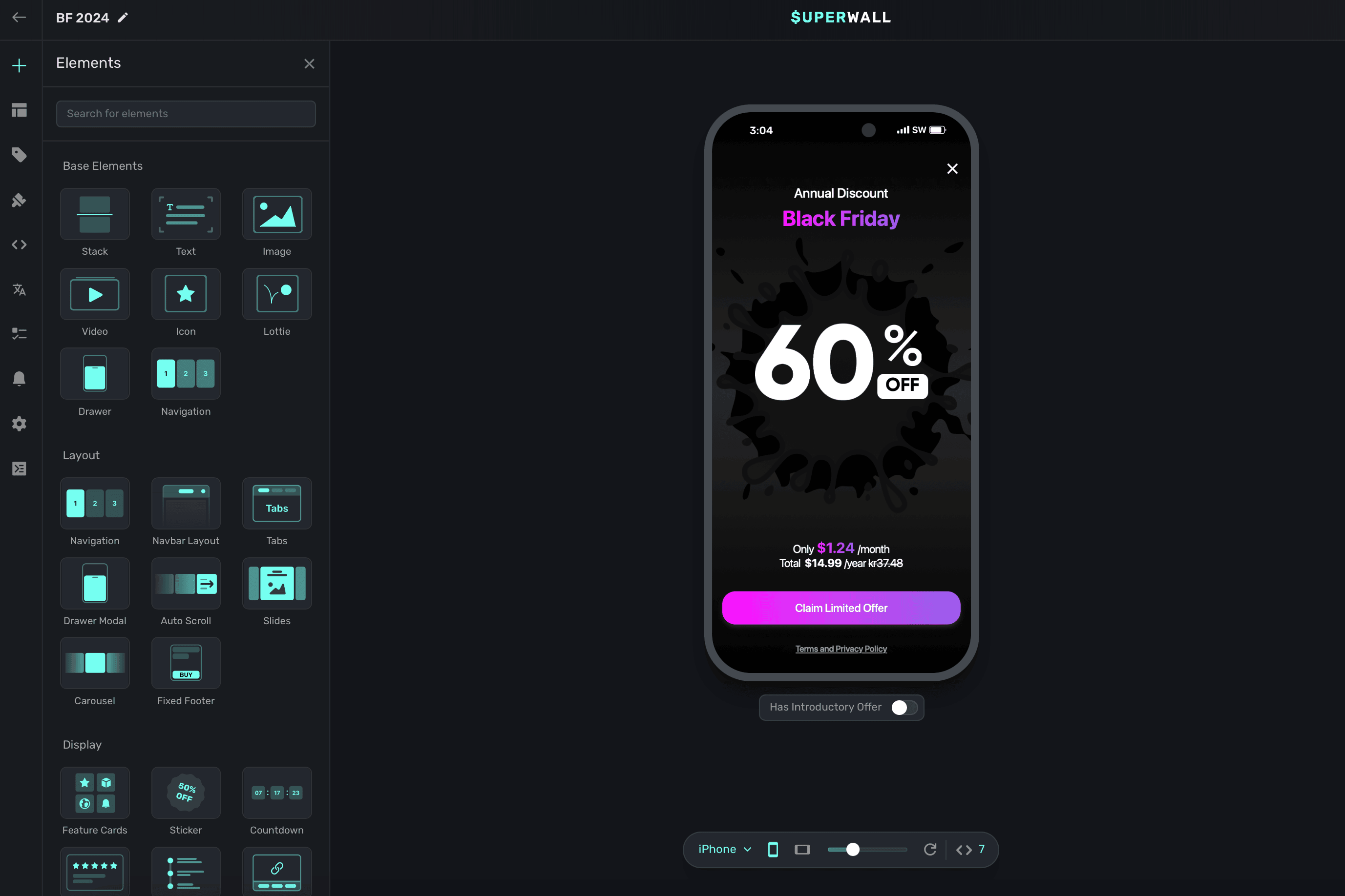
At the top, you can choose from our core, fundamental building blocks such as a stack, text and more.
Most of your layouts should probably start with a Stack component. From there, add child elements to them to construct any layout.
Our stock components include:
- Stack: The foundation of any layout, it works like CSS Flexbox layout. Check out this reference if you're new to Flexbox rules, alignment or just need a refresher.
- Text: Text components that can use variables, different font styles and more.
- Image: Add any image, or URL where it's located, to your paywall.
- Video: Add any video, or URL where it's located, to your paywall. You can choose to loop it, show or hide playback controls, mute it or toggle autoplay. We support most file formats but we do recommend keeping the file size around 2-5 megabytes.
- Icon: Superwall has over 1,000 searchable icons to available, along with the ability to edit their weight and color. You can browse them by category by clicking on the right hand side:

- Lottie: A Lottie file. Either point to a URL of where it's located at, or upload one yourself. You can also customize looping, playback speed and more.
- Drawer: A basic drawer which presents from the bottom that can be configured to dismiss via fluid gestures or manually.
- Navigation: A container to set up multi-page designs, complete with a transition style.
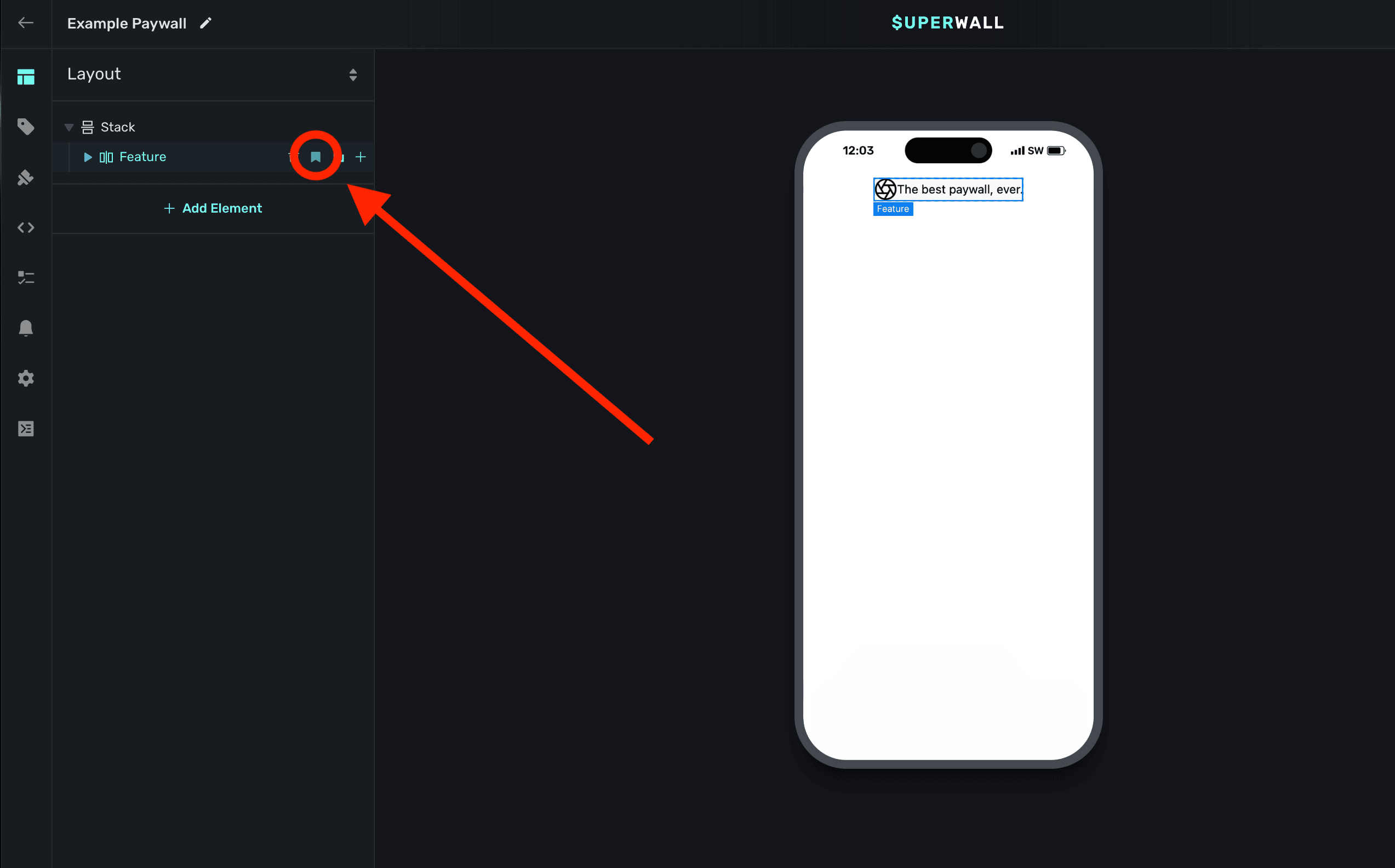
Snippets
Snippets allow you to aggregate one or more components together to reuse. For example, if you have a stack component with an icon and a text label, you could group that together to use as a component either in the current paywall, or another one later.
To add a snippet, select the component you want to use for your snippet and click the bookmark icon:
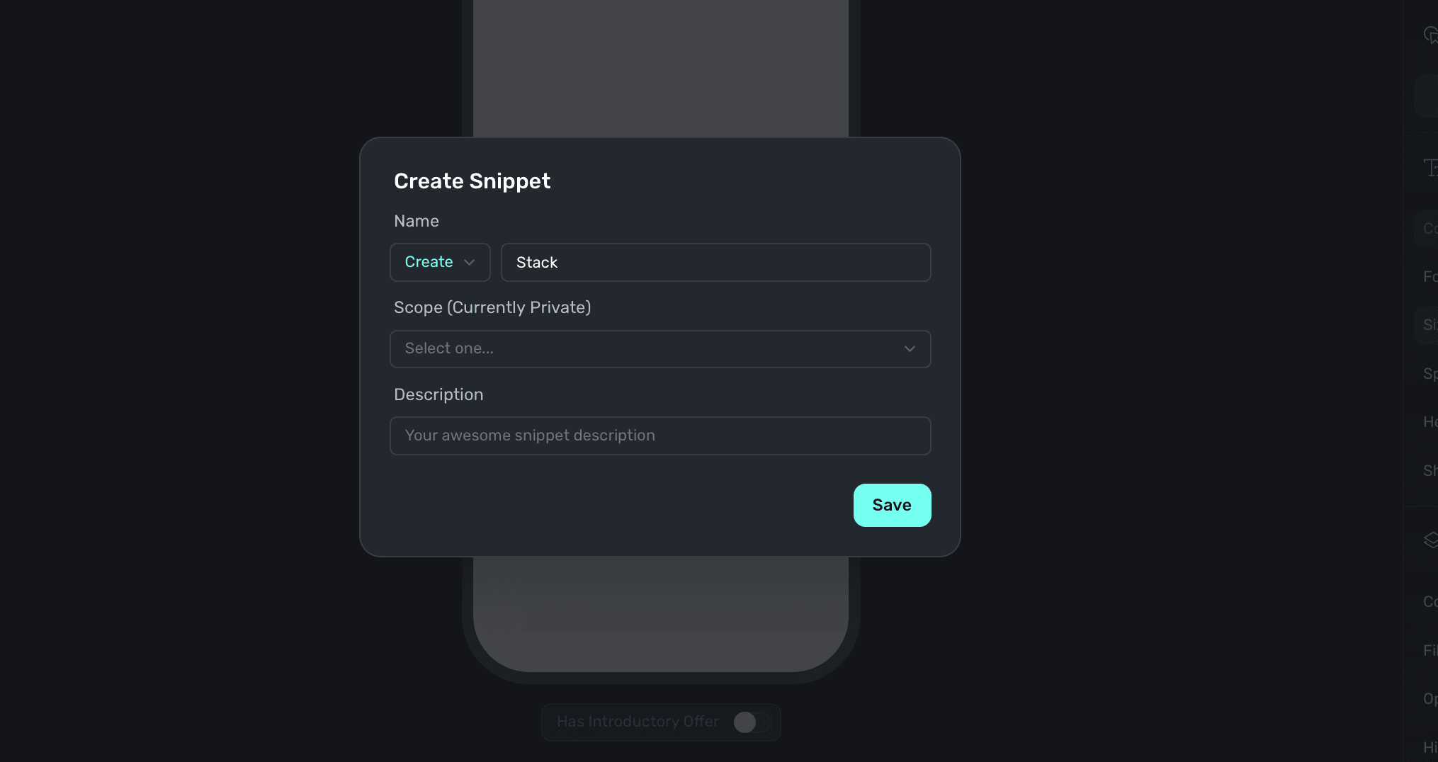
Then, give your snippet a name and add a description. When you're finished, click Save:
From then on, you can reuse it when adding a new component to any paywall. You'll see your own snippets at the bottom. Here's an example of a few custom snippets:
Note that you can edit any snippet you add, it will not overwrite the original snippet. If you do want any edits you make to be used as a snippet, simply make another snippet with the one you've edited.
Re-ordering components or adding them as children
To reorder components on your paywall, you can simply drag and drop them in the Layout tab:
- Hovering on another component will add the current component you're dragging as a child of the other component.
- Hovering above or below other components will reorder the component you're dragging either above or below the other component.
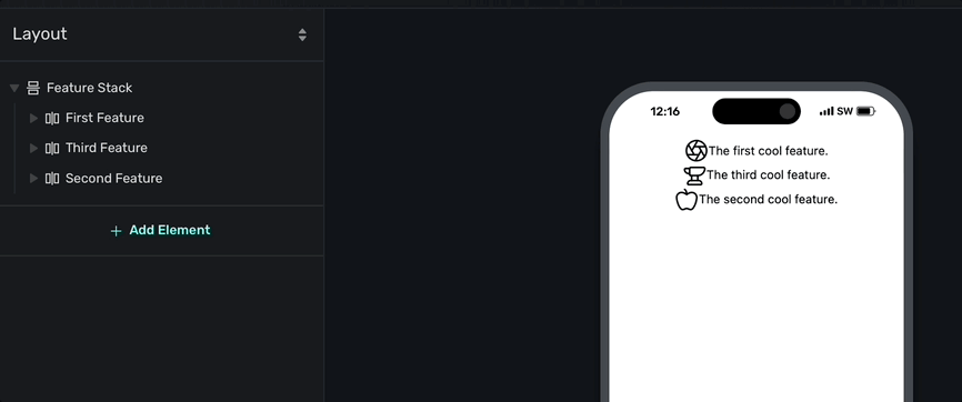
You'll see a box filled in when you're adding a component as a child component, or you'll see a thin line to indicate you're reordering components. In the image below, notice how "The second cool feature" should be listed in the middle. Simply dragging it above the component in the middle will correctly reorder it:
Reordering and adding components as children is all done via the Layout tab. It'll always represent the current hierarchy of your paywall's components.
Deleting, renaming and copying elements
You can delete and copy components by selecting them in the Layout tab and then clicking on one of the following icons as seen in this image:
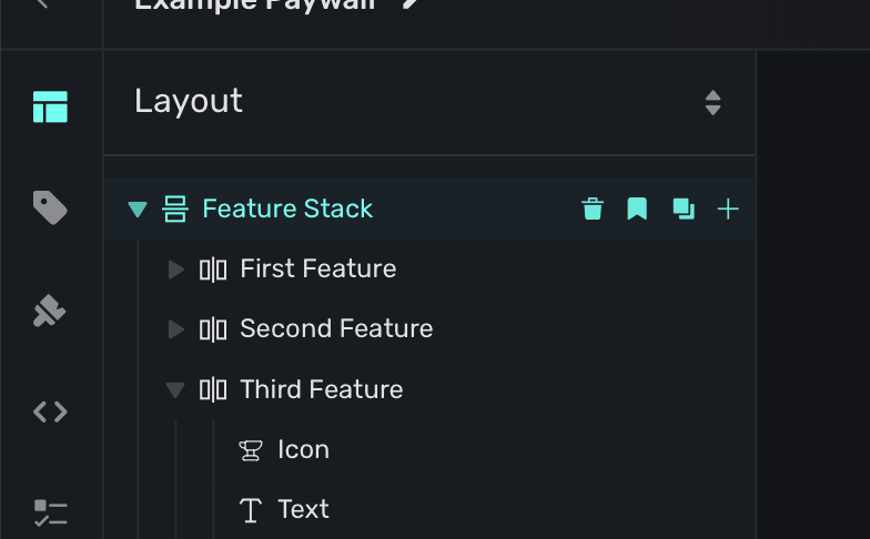
From left to right, here's what each icon does:
- Trashcan: Deletes the component.
- Bookmark: Creates a snippet from the component.
- Square on Square: Copies the component.
- Plus sign: Adds a new component.
To rename a component, double click on its current name to edit it.
Component editor
Any component you select will open its editable properties in the component editor, which is on the right side of the editor window. You can change padding, text and anything related to a component here. To learn more, check out the dedicated page over editing components here.
Editor toolbar
In the top right of the editor, you'll see a toolbar with a few icons:
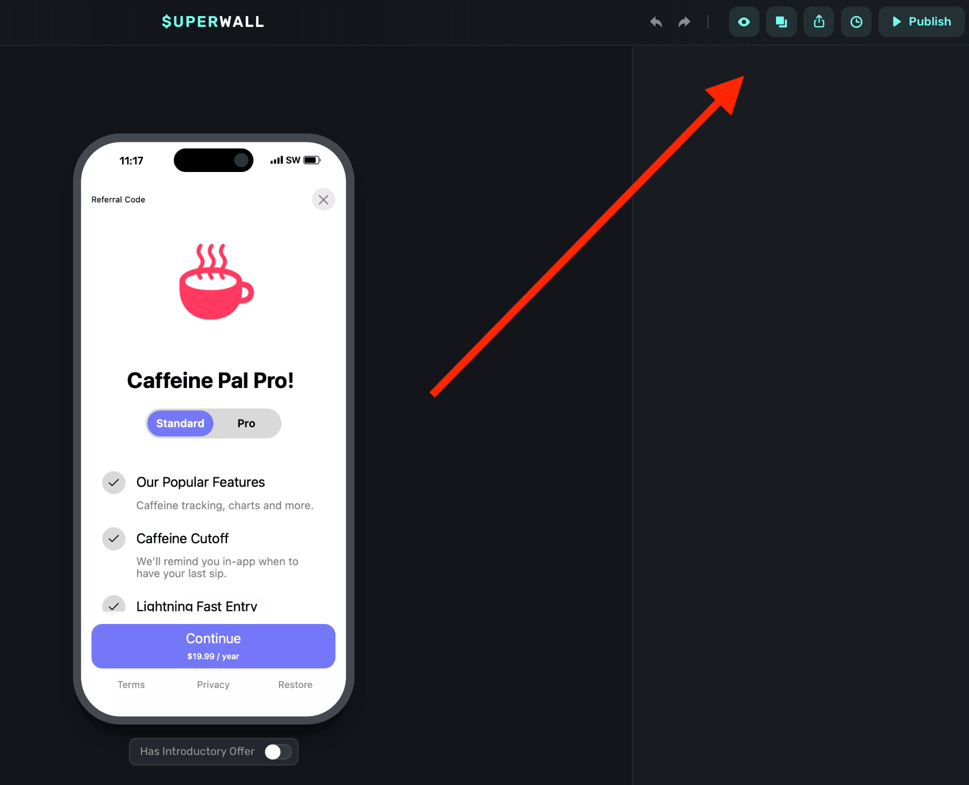
From left to right, here's what each icon does:
- Undo: Undo the last action. You can also use the
command/control+Zkeyboard shortcut. - Redo: Redo the last action.
- Preview: Preview the paywall on device. For more, read this doc.
- Duplicate: Duplicate the current paywall within the current project, or into another one.
- Share: Allows you to share your paywall externally. See "Paywall sharing" below for more.
- History: View paywall edit history and revert to a previous version. See "Paywall history" below for more.
- Publish: Publish the current edits to your paywall and make them live.
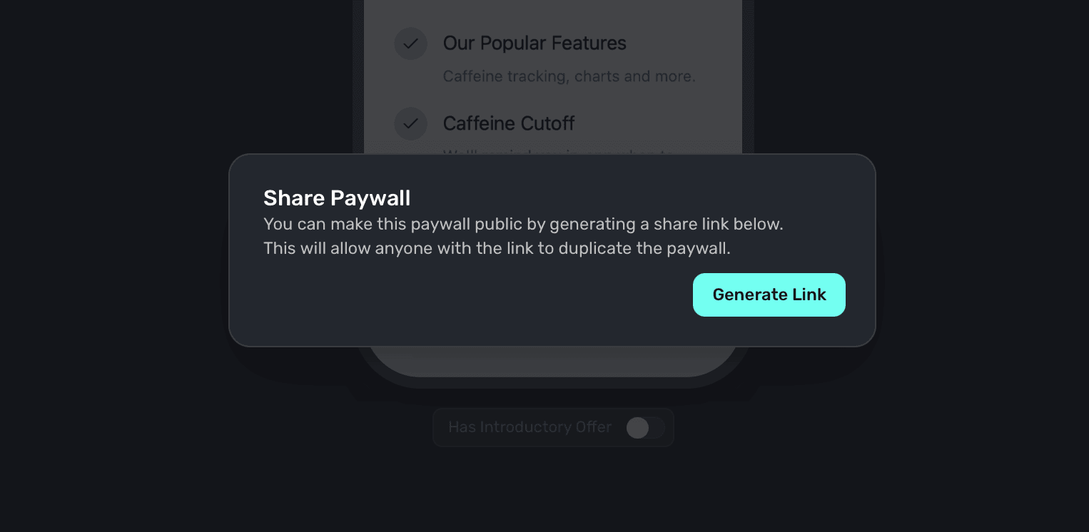
Paywall sharing
Clicking the share icon allows you to share your paywall externally. This is useful for sharing with your team or clients. Once you click on share, you'll be prompted to generate a link:
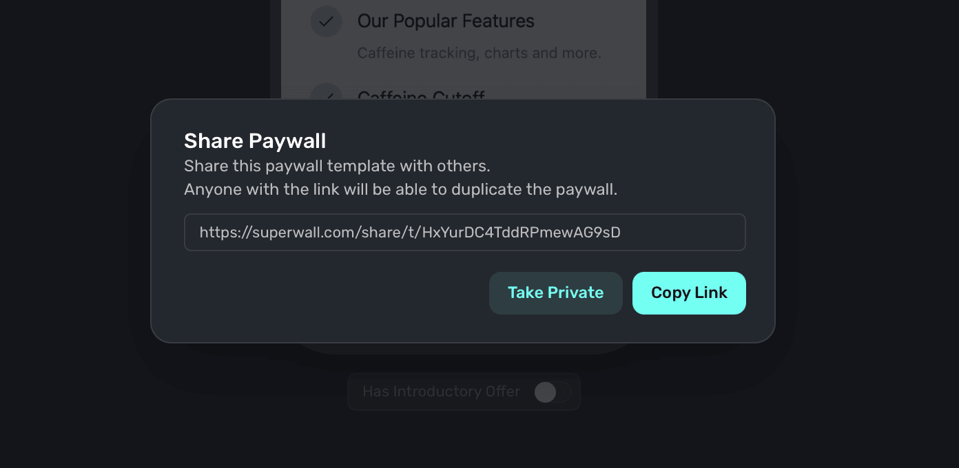
From there, you can share the link with anyone. When they open it, the paywall will be duplicated into their own Superwall project (though, without your existing products):
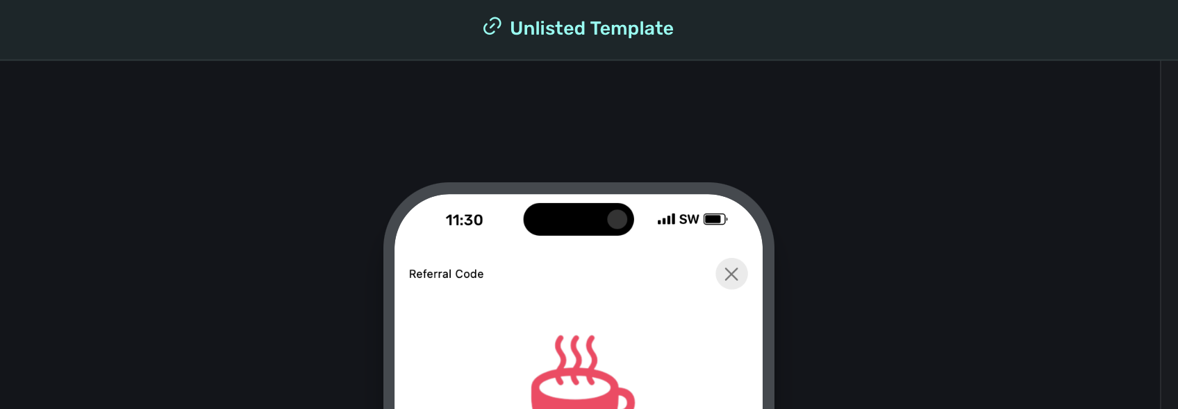
You'll know that a paywall has a share link available when the green banner at the top of the editor is present:
To make the paywall private again, simply click the Share button once more and click the Make Private option.
Paywall history
All edits you make in the paywall editor are stored in the history view:
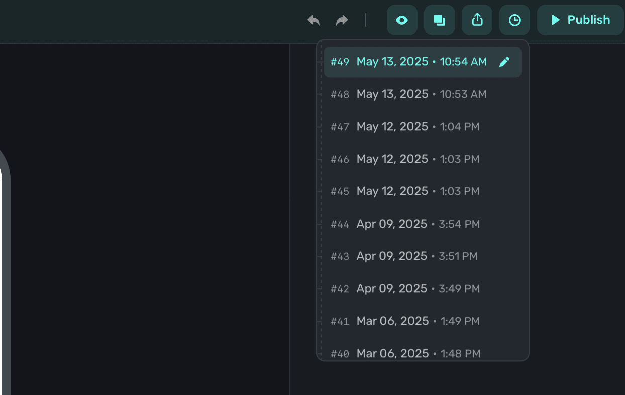
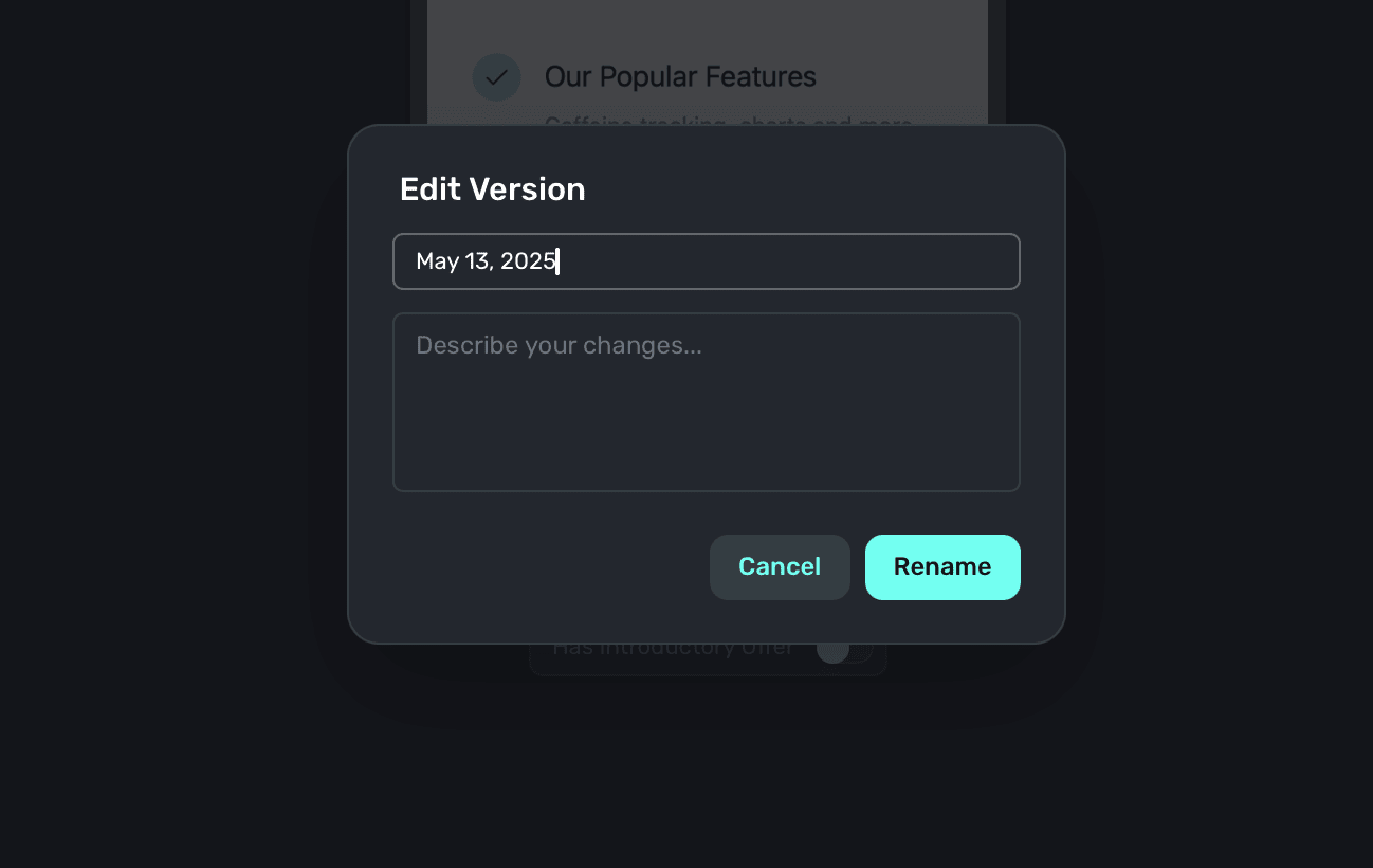
Click on any entry to rollback your paywall to that version. Additionally, you can rename and add more context about any entry by clicking the pencil icon:
Anytime you save a your paywall, a new entry will be created in the history.
To quickly see a snapshot in your history, you can click on an entry and it will show a live preview in the editor.