Drawers
Use Superwall's drawer component to display content presented in response to a button tap or a variable changing.
Adding a drawer component
The drawer component was built to make displaying contents from a bottom drawer easy, right out of the box. To use the drawer component:
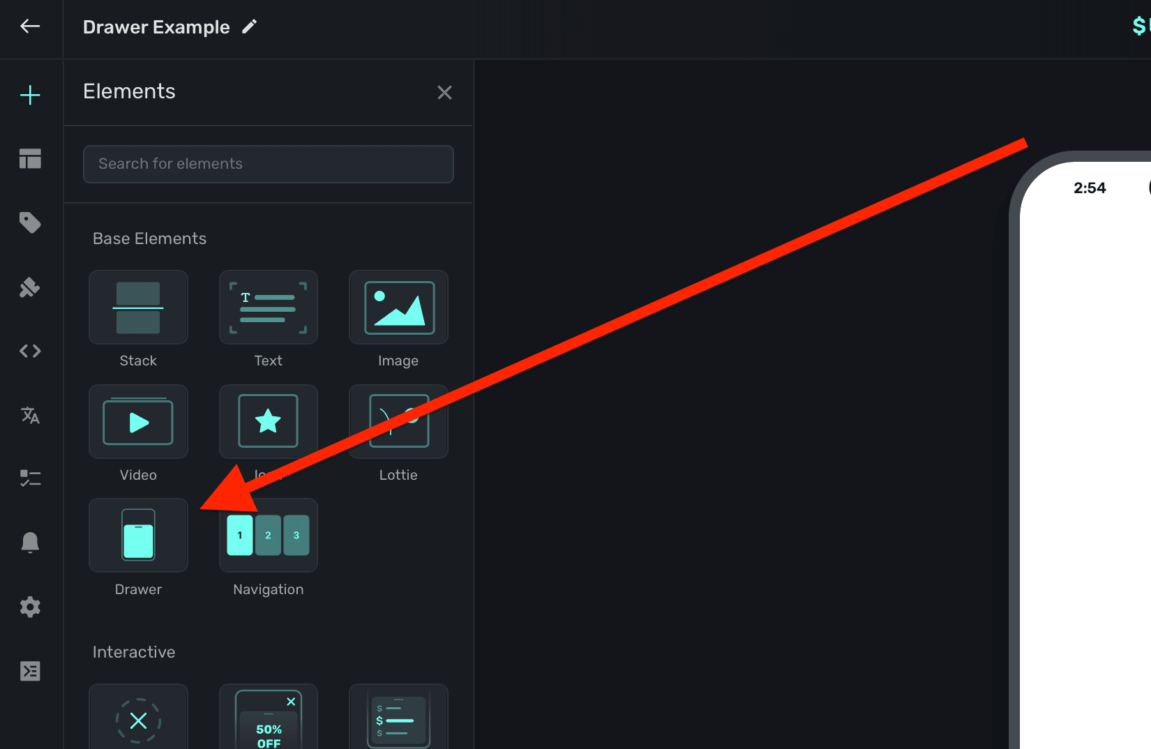
- In the left sidebar, click + to add a new element.
- Choose Drawer under the "Base Elements" header.
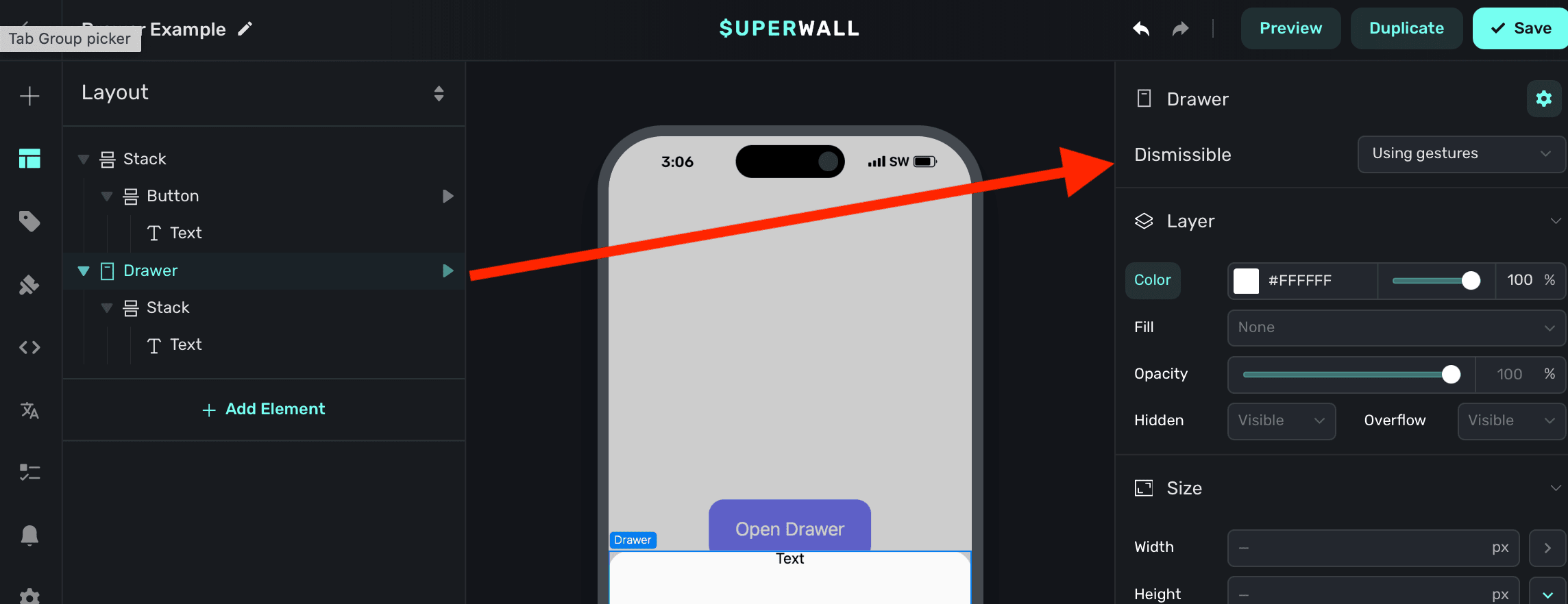
Drawers will automatically show a dimming view behind them when presented. Tapping on it will dismiss the drawer. By default, they are interactive — meaning they can be dismissed via a drag gesture. You can also change this to be manual, letting you explicity control when it presents or dismisses. Toggle this under the Dismissable property:
Presenting drawers
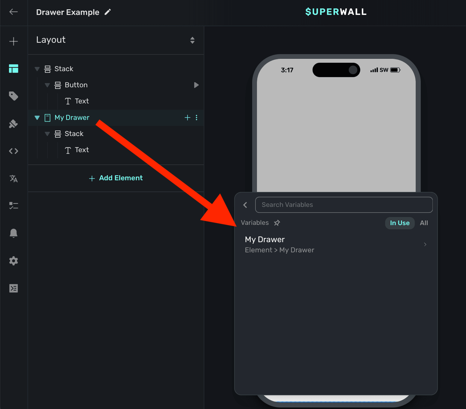
When a drawer element is added, Superwall automatically creates an element variable for it (accessed through the Variables tab in the left sidebar, or the variables button in the floating toolbar). Its name will match whatever is in the element hierarchy in the left sidebar:
To toggle its open state, you can use a tap behavior on a button or another element. In this example, we add a tap behavior to the button, which toggles the element variable's Is Open value:
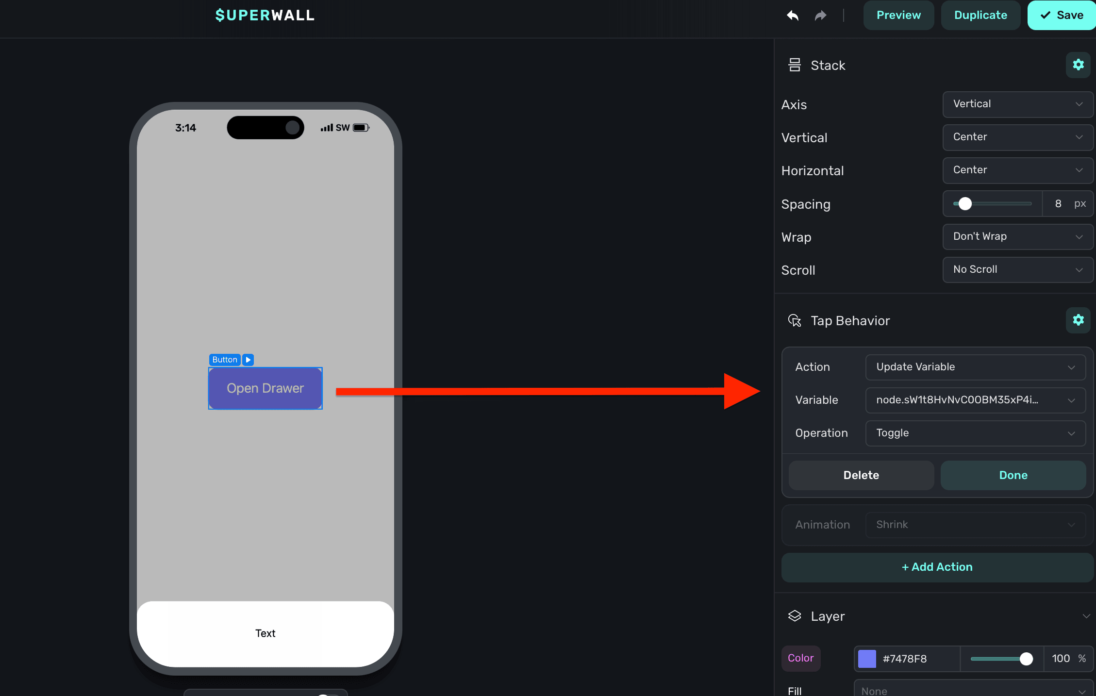
The variable's name is derived by the node's unique identifier. You don't need to set or generally be aware of this value.
Adding content to drawers
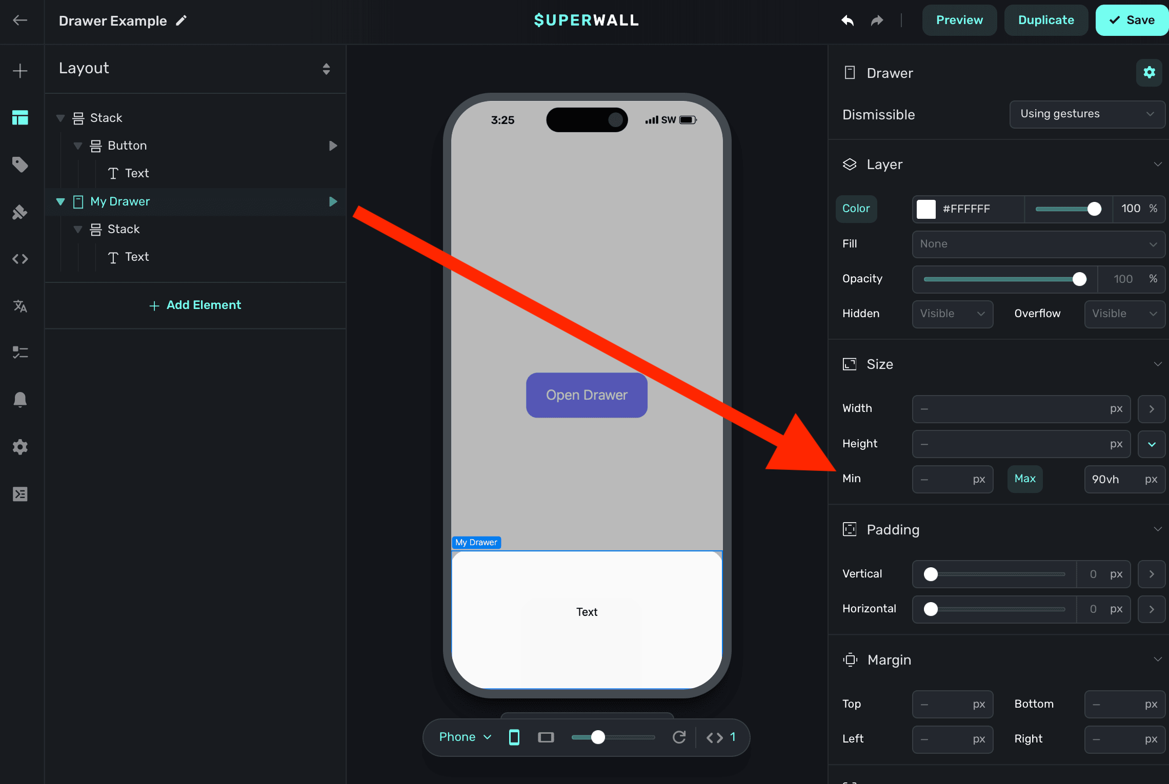
By default, drawers have a minimum height set. This is a general size that works well, but in most cases you'll want to add a stack and have the drawer derive its height from that. Or, you can add a stack and set its height equal to the drawer's minimum height. Generally, that approach is not as flexible since you likely want the drawer's height to be determined by the content inside of it:
By default, there is a minimum height on the drawer. Here, we've removed that so that the inner stack will control its height: